Preslee
Yeargin
GRAPHIC DESIGN
PORTFOLIO
KINDLING SNACKS
E-Commerce Design
Social Media Design
Packaging Development
Experience
GREEN SLEEVES
LANDSCAPING
Logo Design
Visual Identity
SIP HAPPENS
Packaging Design
Dieline Development
Brand Concept
GELATO PALACE
Brand Identity
Brand Applications
Layout Design
Kindling Snacks
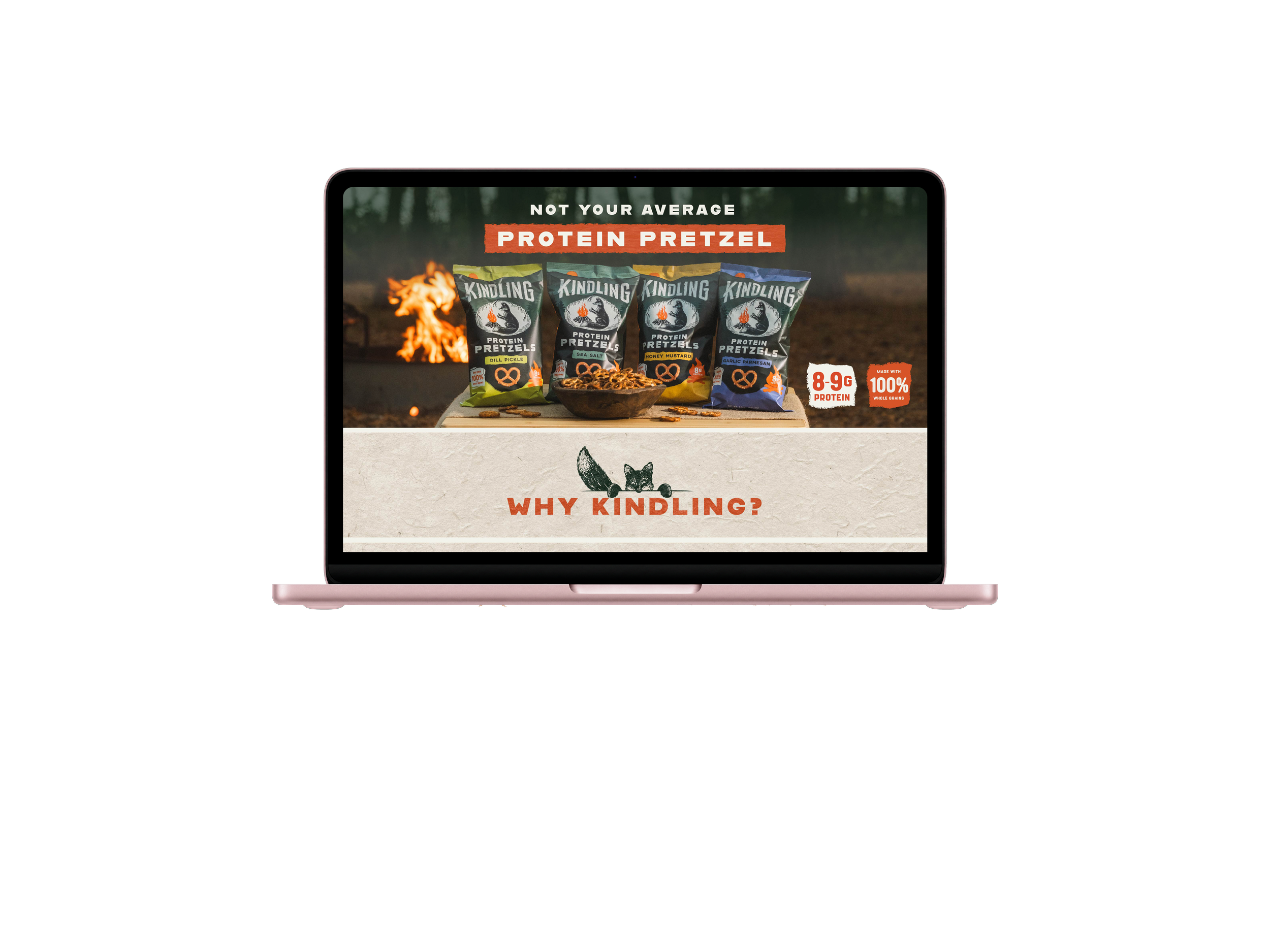
AMAZON A+ CONTENT
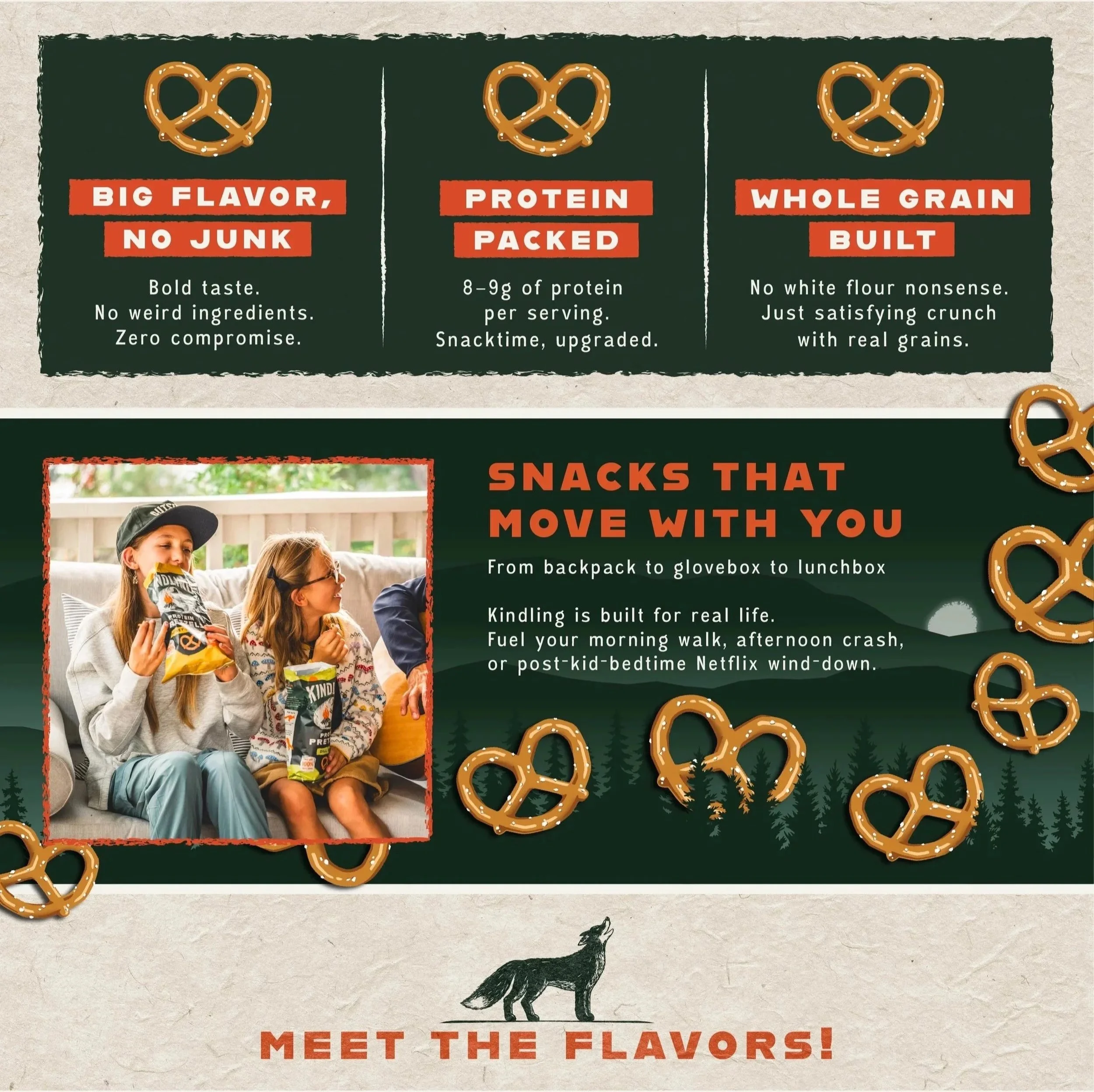
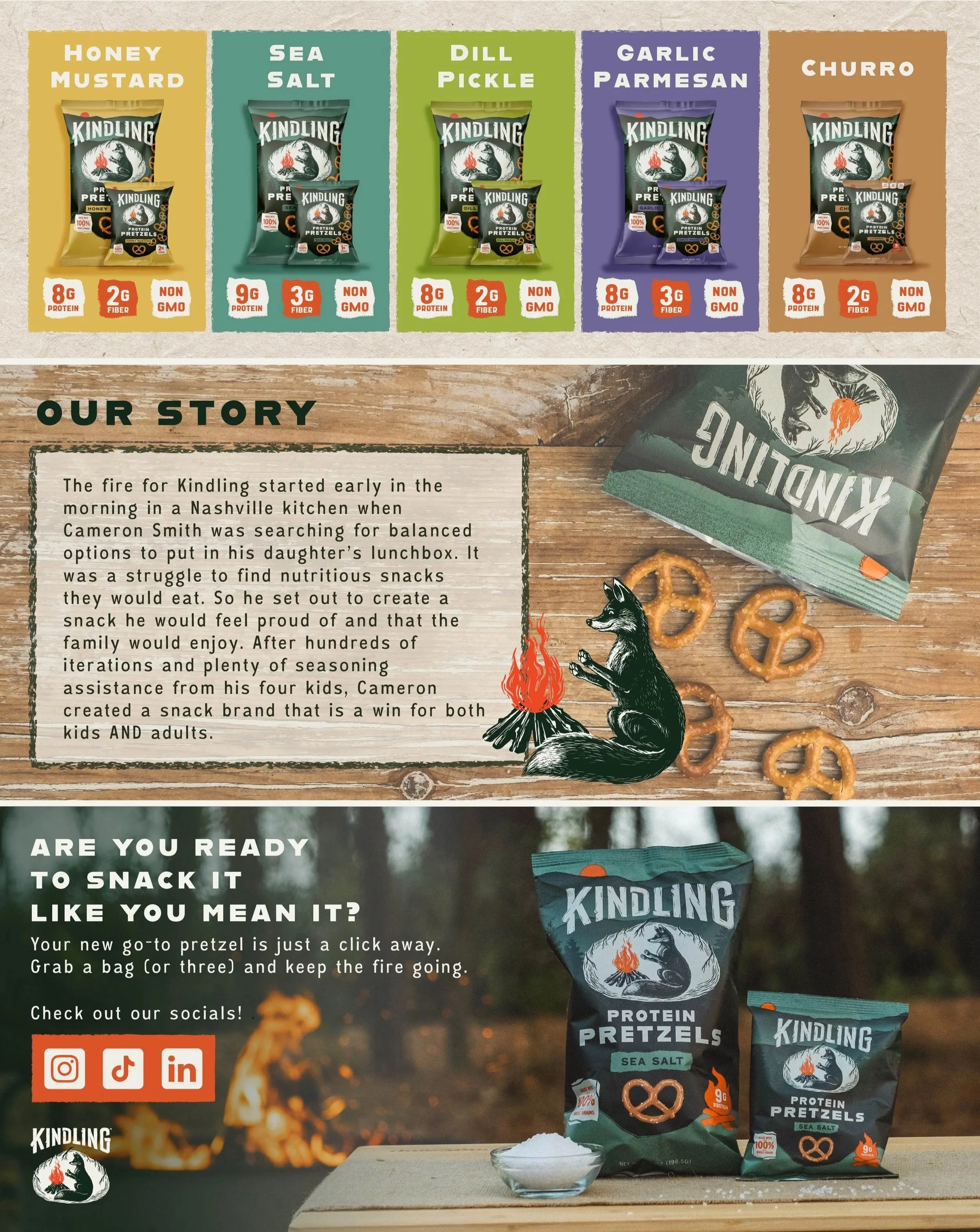
As a graphic designer for Kindling,
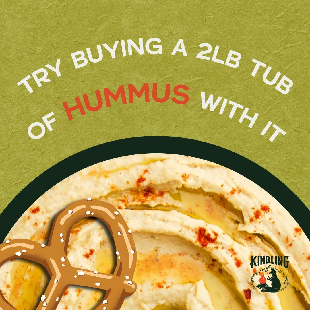
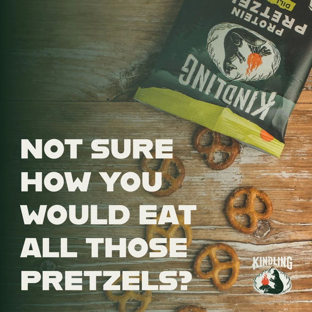
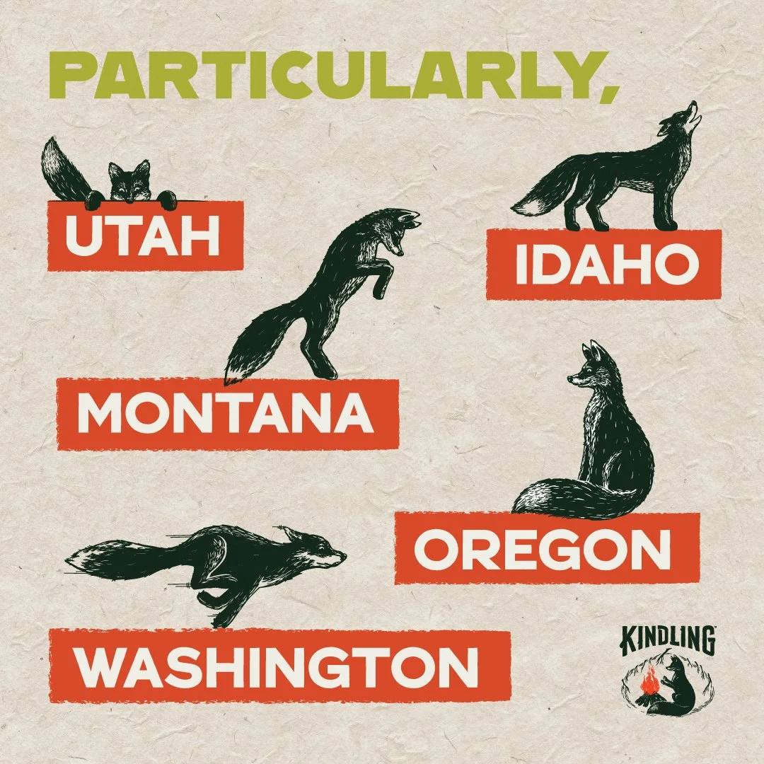
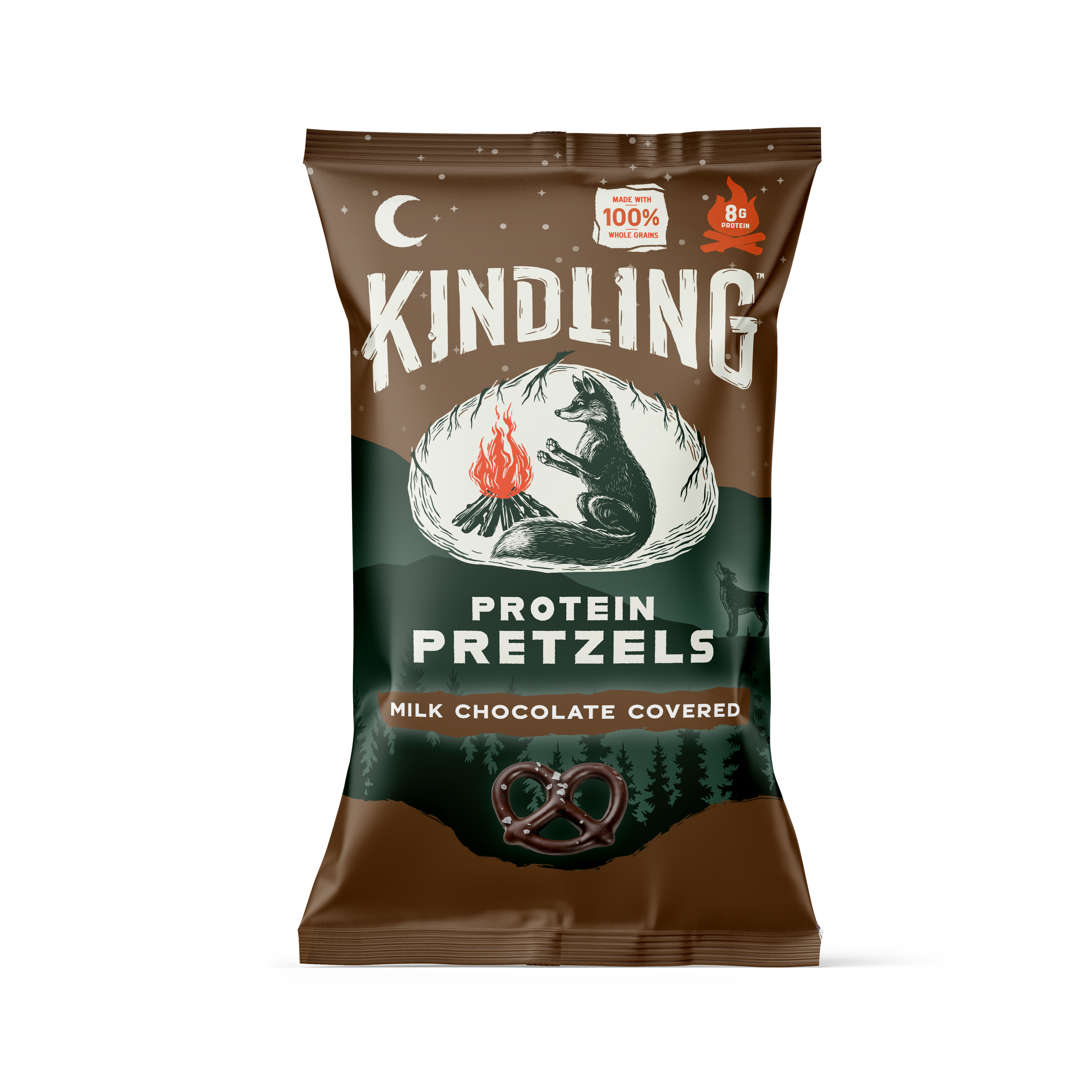
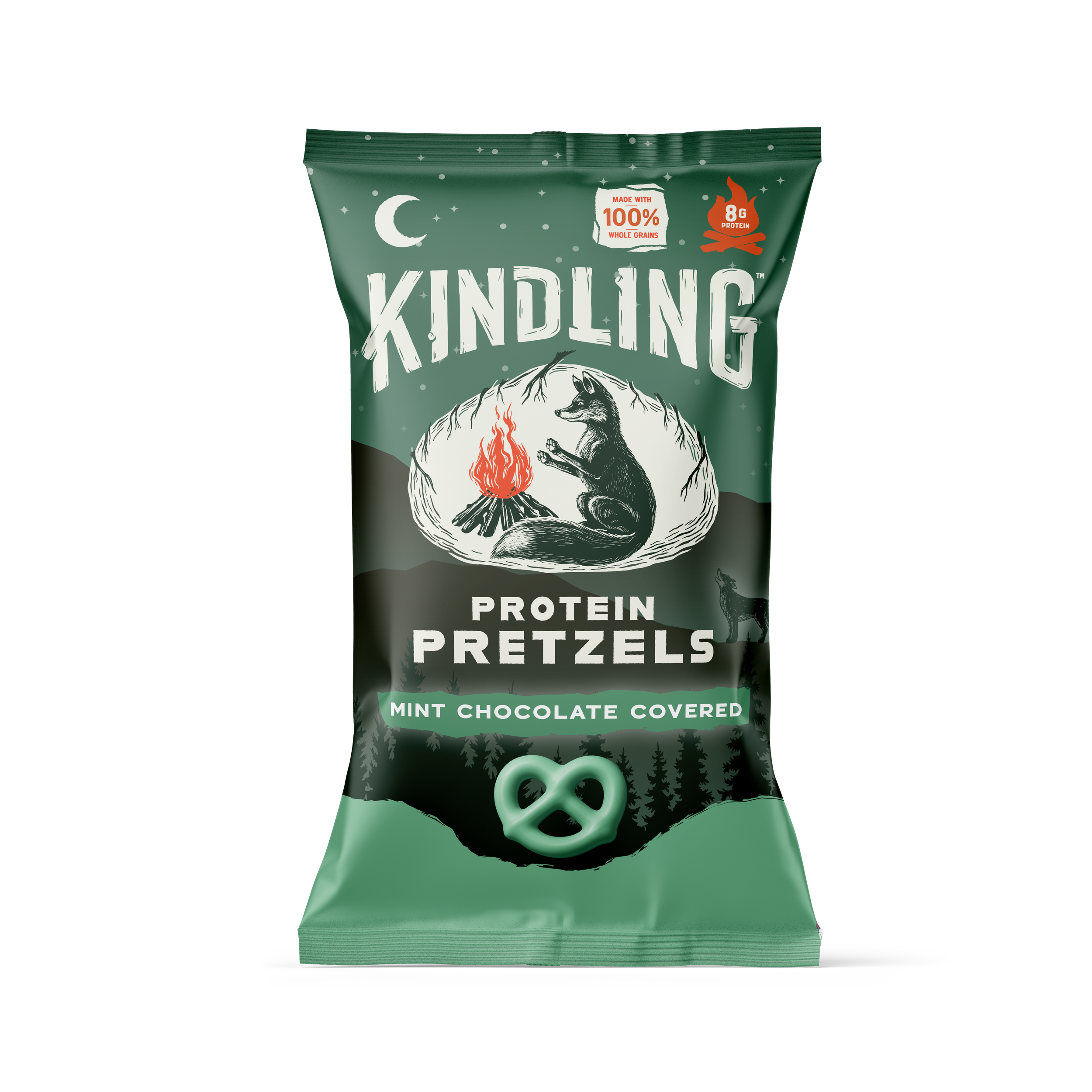
I worked closely with the design team on projects across Amazon, social media, and packaging development. I independently took on projects such as A+ Content, PDPs, Costco campaign graphics, and new flavor and layout concepts, working through feedback and revisions with the brand owner.
I also supported the design team with packaging updates, file organization, and final checks to ensure artwork was accurate and print-ready.
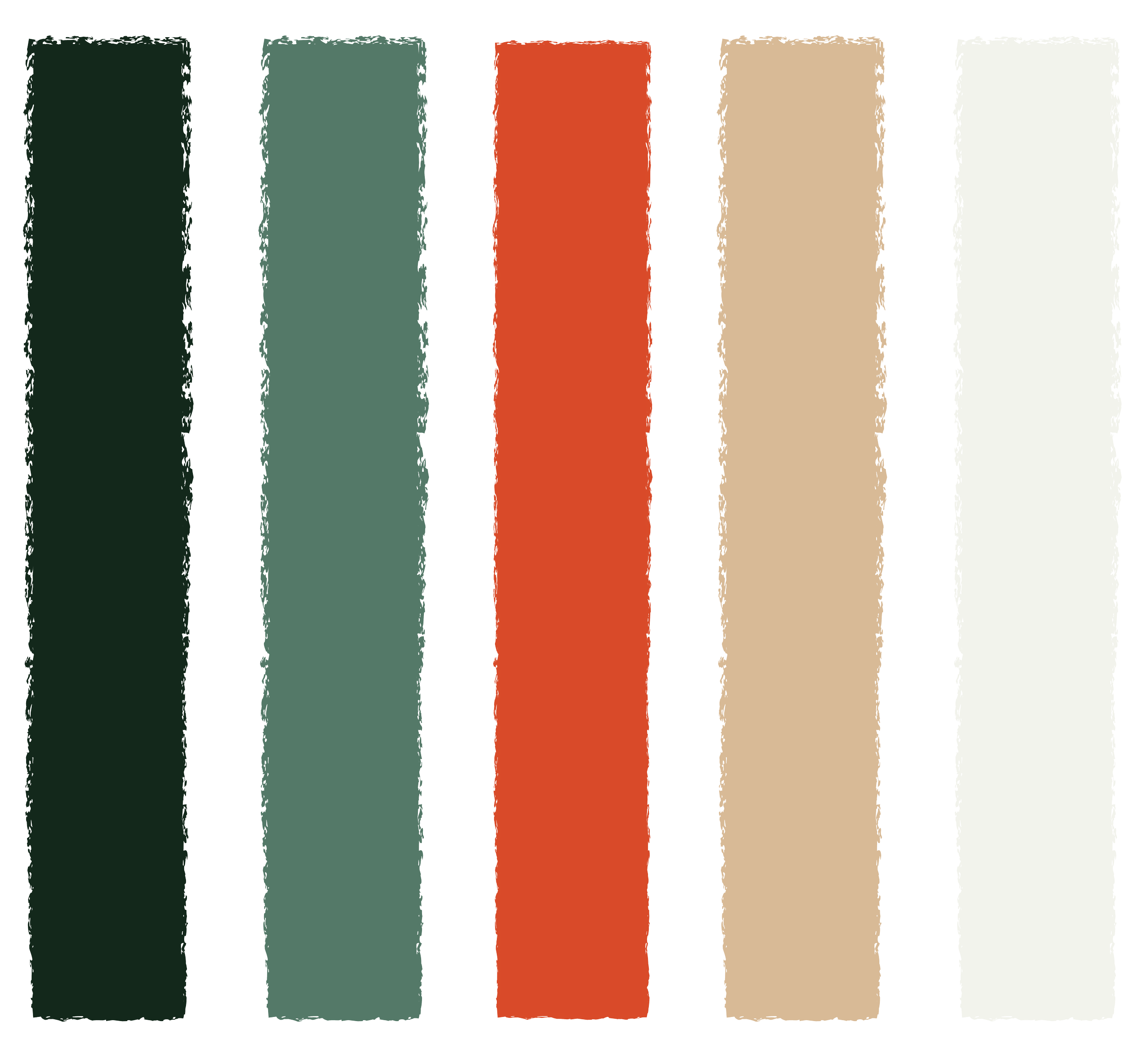
Kindling already had an established visual identity,
but as the brand grew, it needed support carrying that identity consistently across new touch points. The challenge was to create work that felt distinctly Kindling while communicating clearly across e-commerce, social media, and packaging.

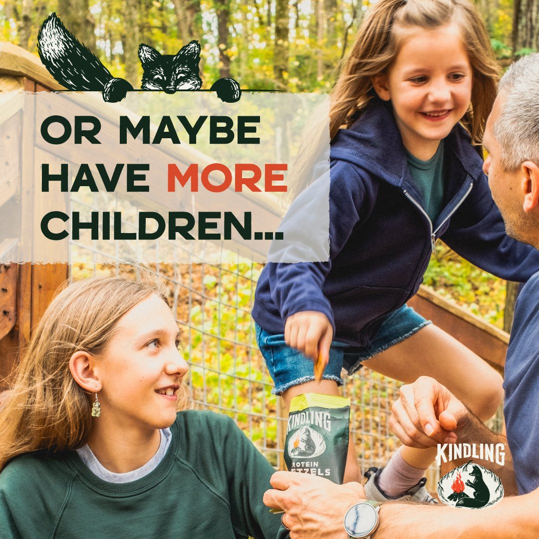
COSTCO SOCIAL LAUNCH
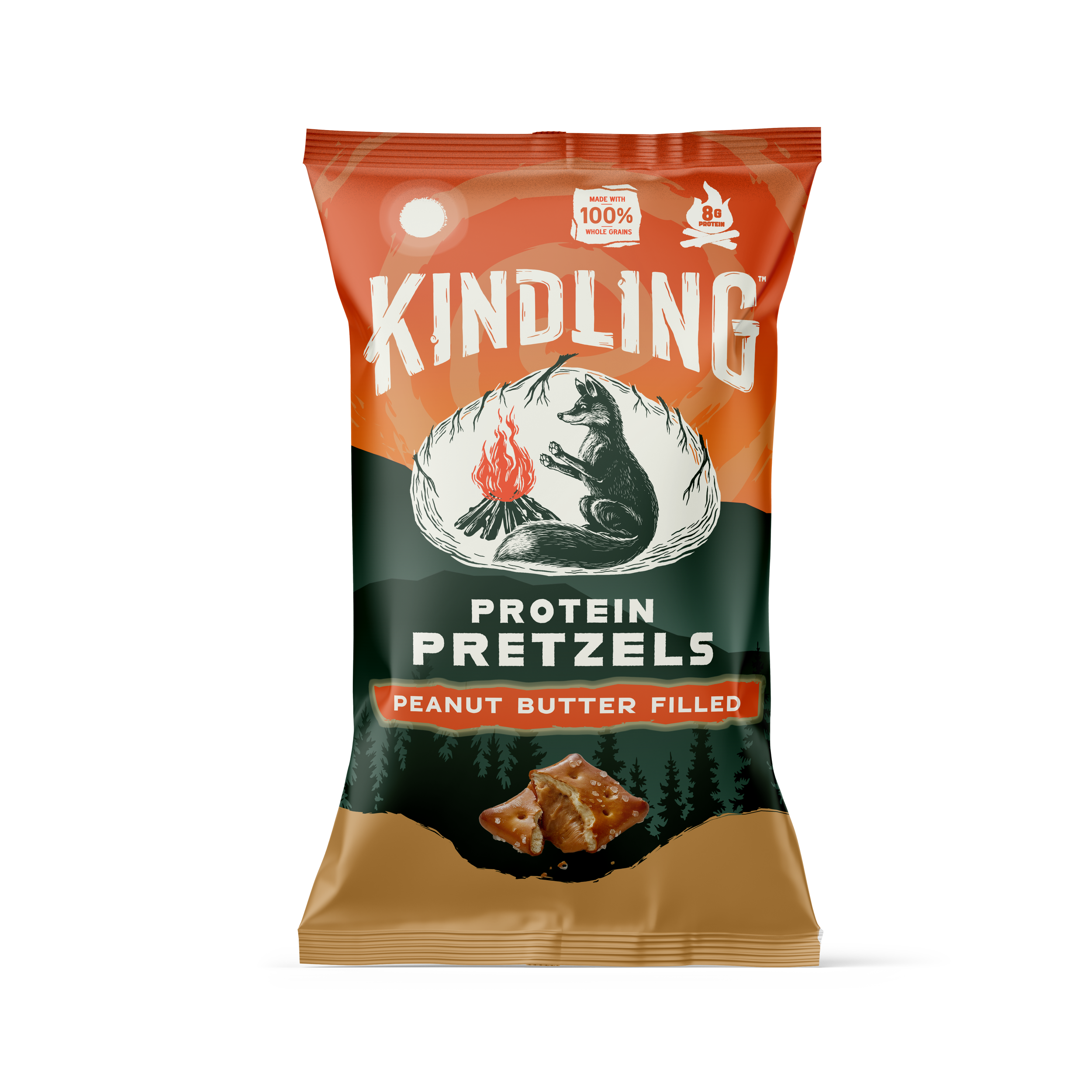
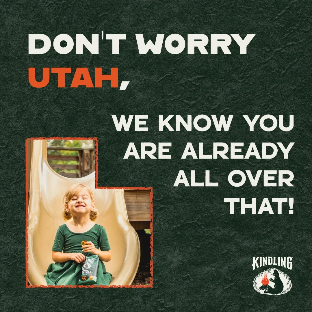
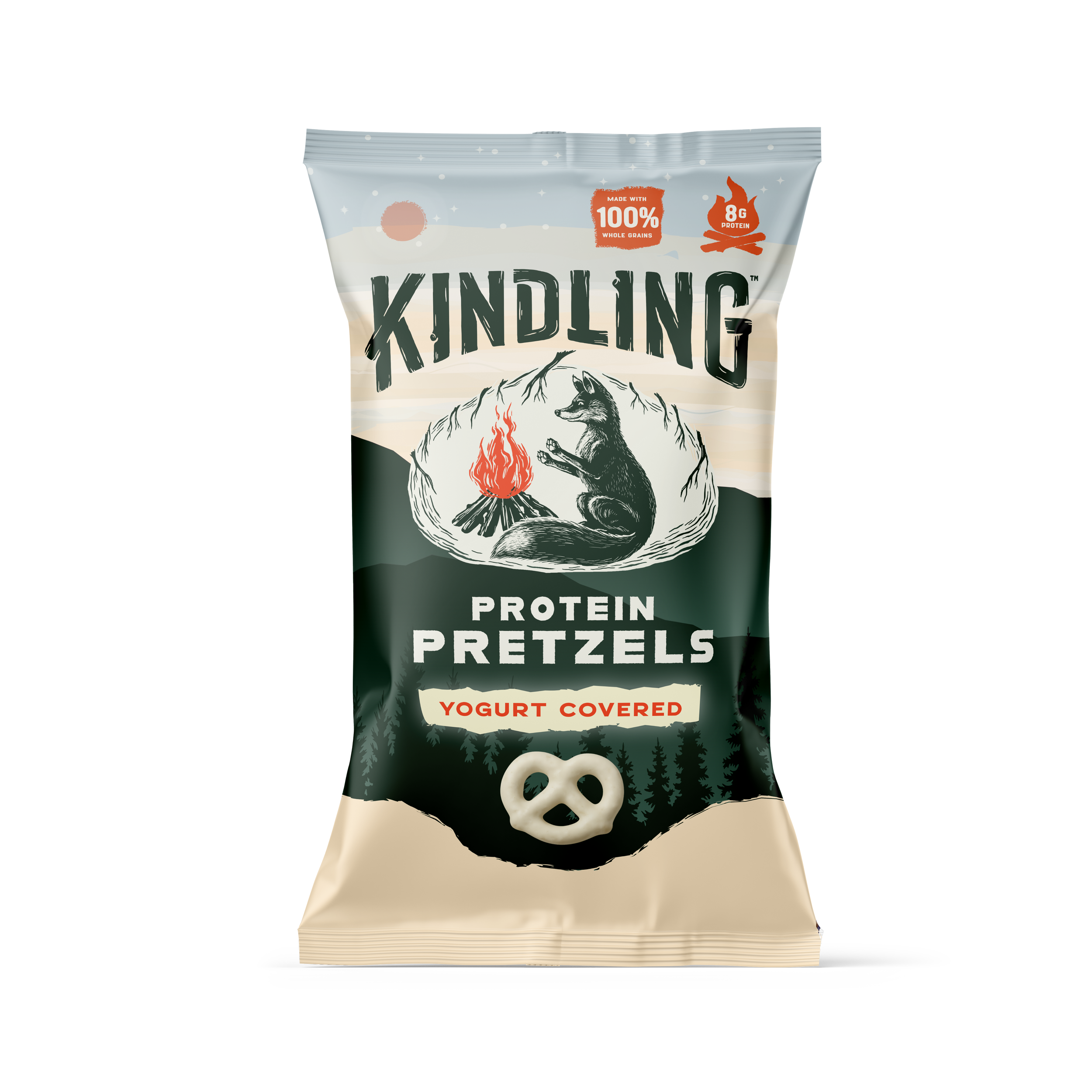
01 — Start with the Content
Each project started a little differently. I first looked at what I had to work with—copy, photography, existing illustrations, or an open direction—and considered the audience and platform before designing.
02 — Explore the Direction
I looked at Kindling’s existing materials and relevant competitors for context, then explored layouts that brought the content together while staying true to the established brand.
03 — Refine & Adapt
From there, I shared concepts for feedback and refined them based on the needs of the project. Some required small adjustments, while projects like Amazon content went through multiple rounds to meet platform requirements.
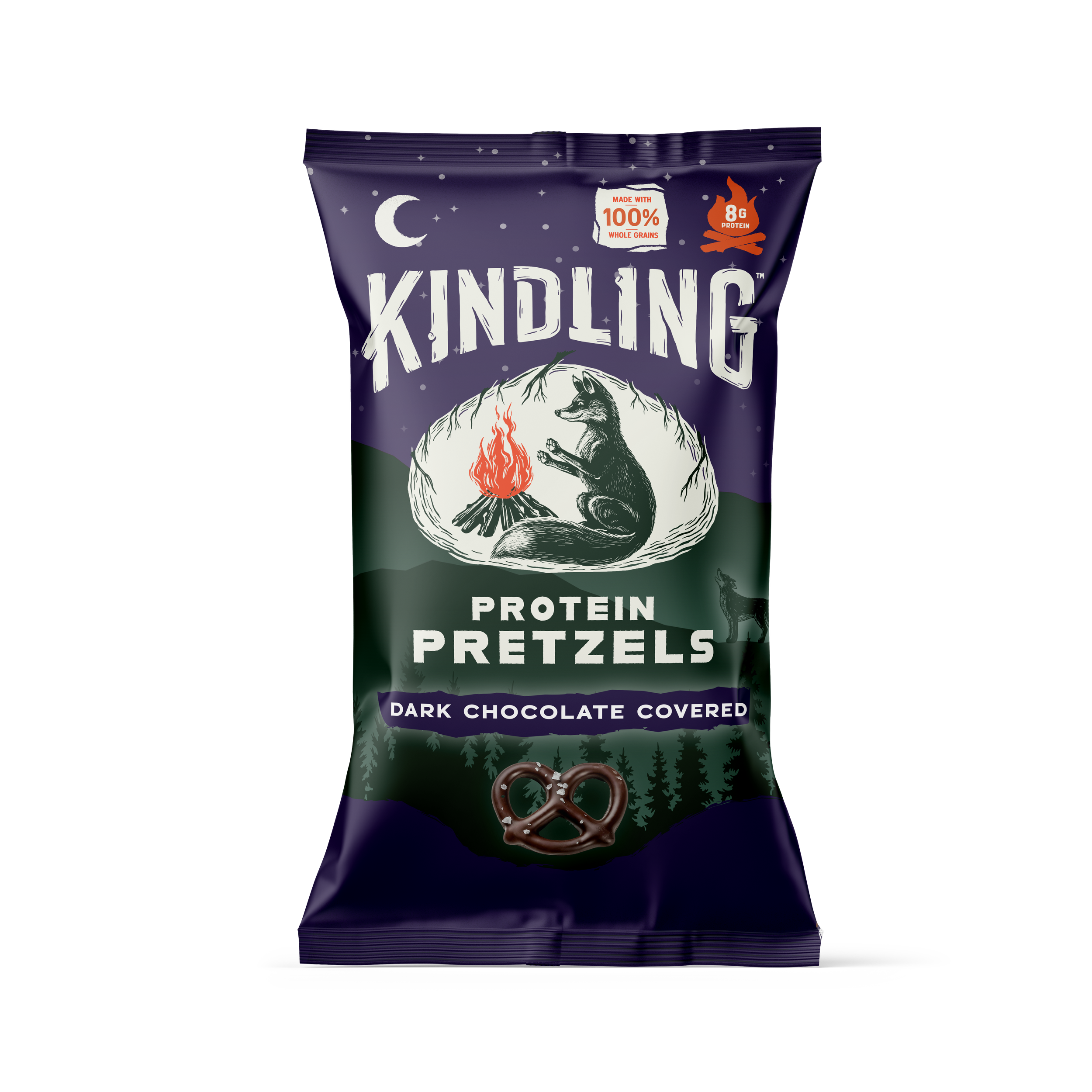
FLAVOR INNOVATIONS
Green Sleeves Landscaping
Working directly with the owner,
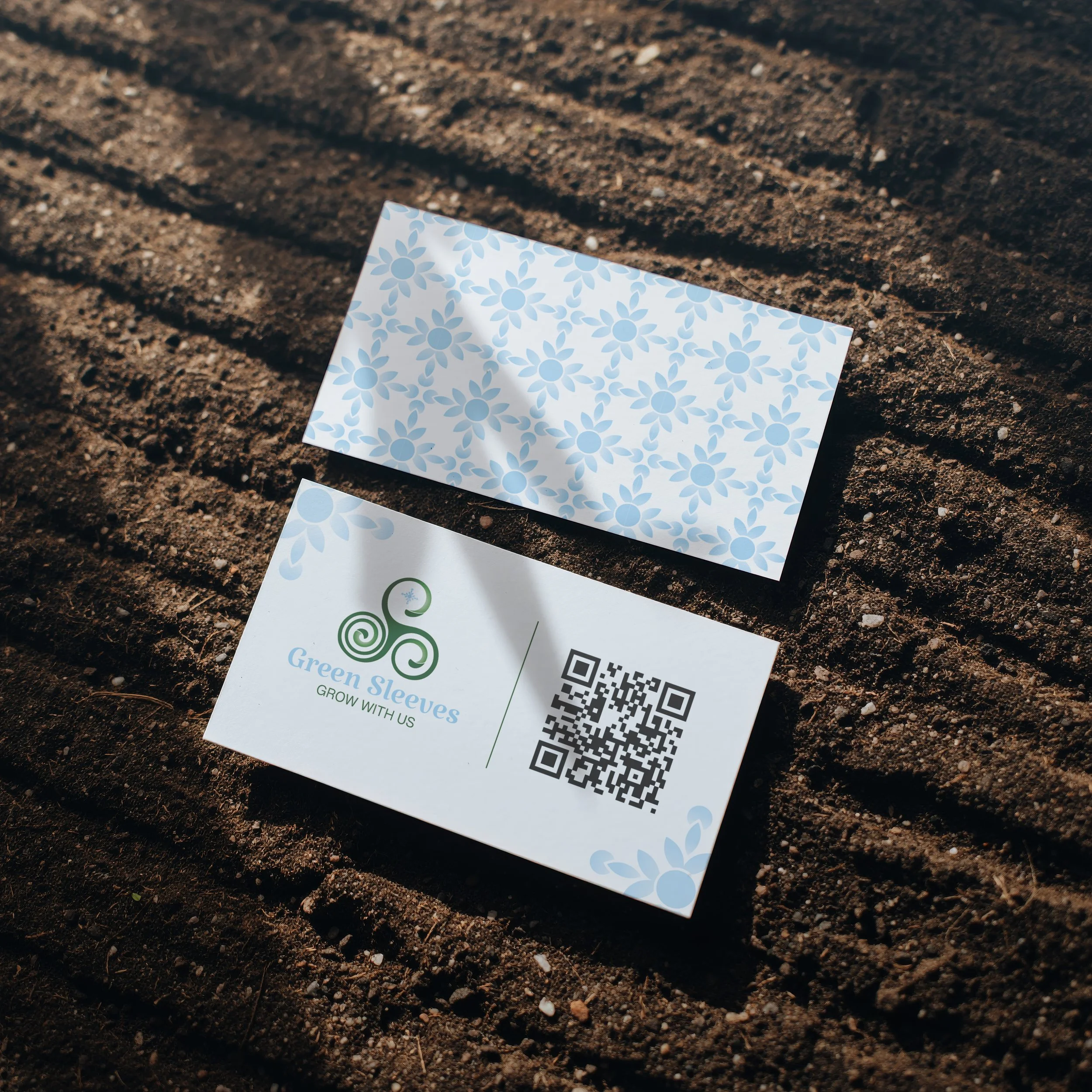
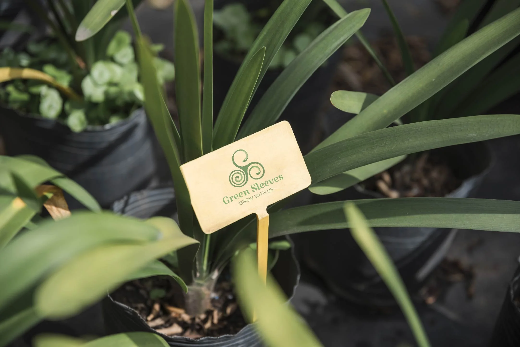
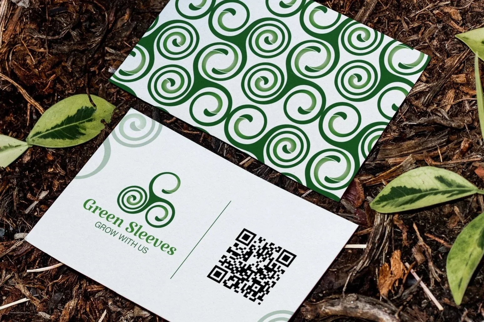
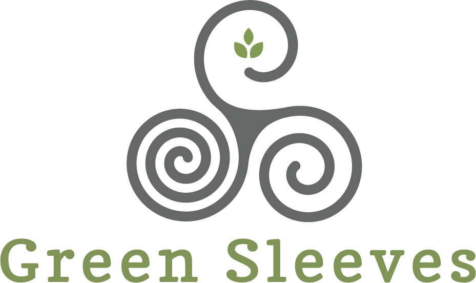
I redesigned the logo and developed the supporting visual identity, including secondary marks, seasonal variations, color, typography, patterns, and business cards. I also helped guide the client through the design process and explain how each piece worked together.
Greensleeves had an existing logo,
that no longer reflected the quality or personality of the business. What began as a logo refresh became an opportunity to build a more cohesive identity that could grow with the company.
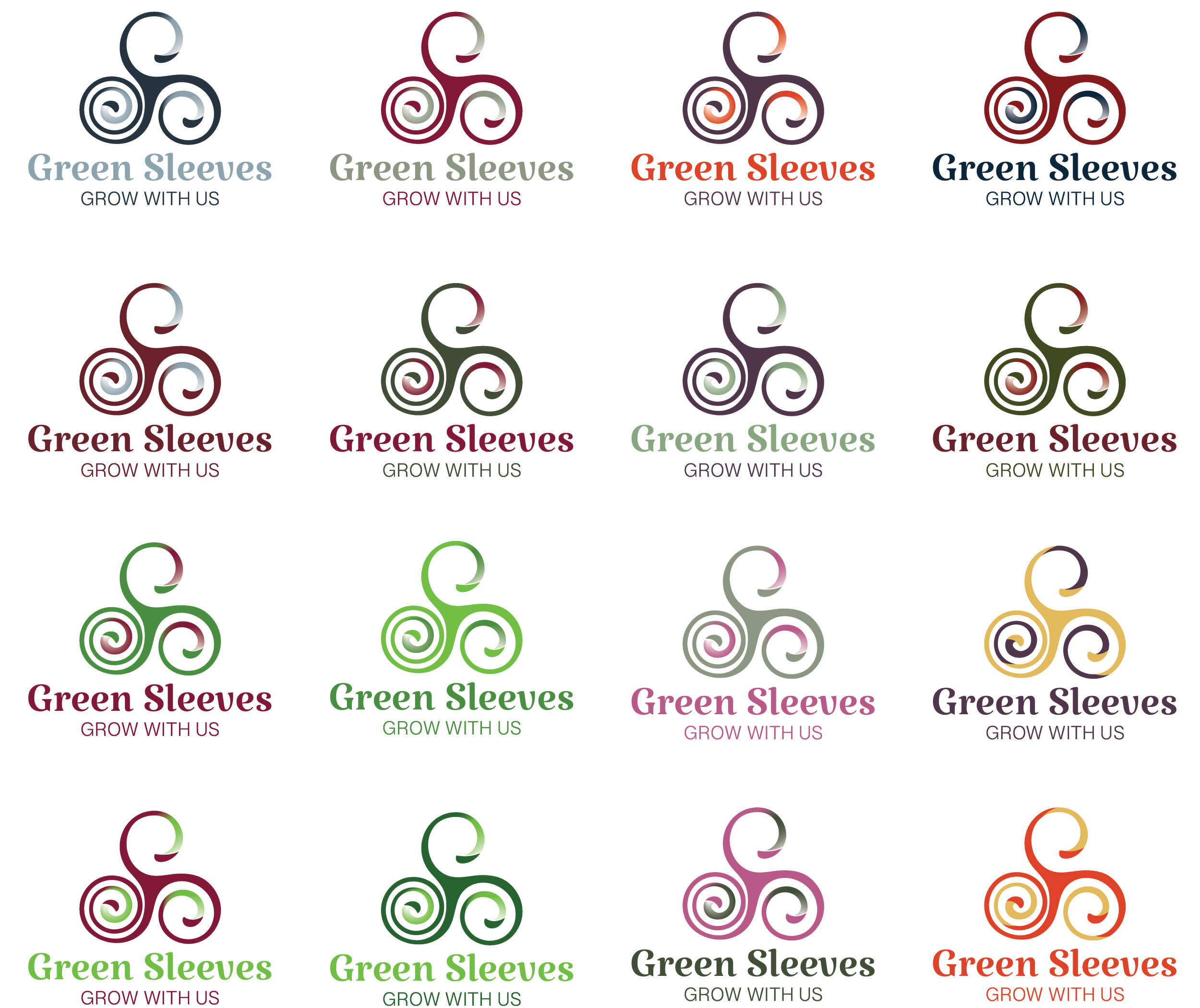
02 — Color Exploration
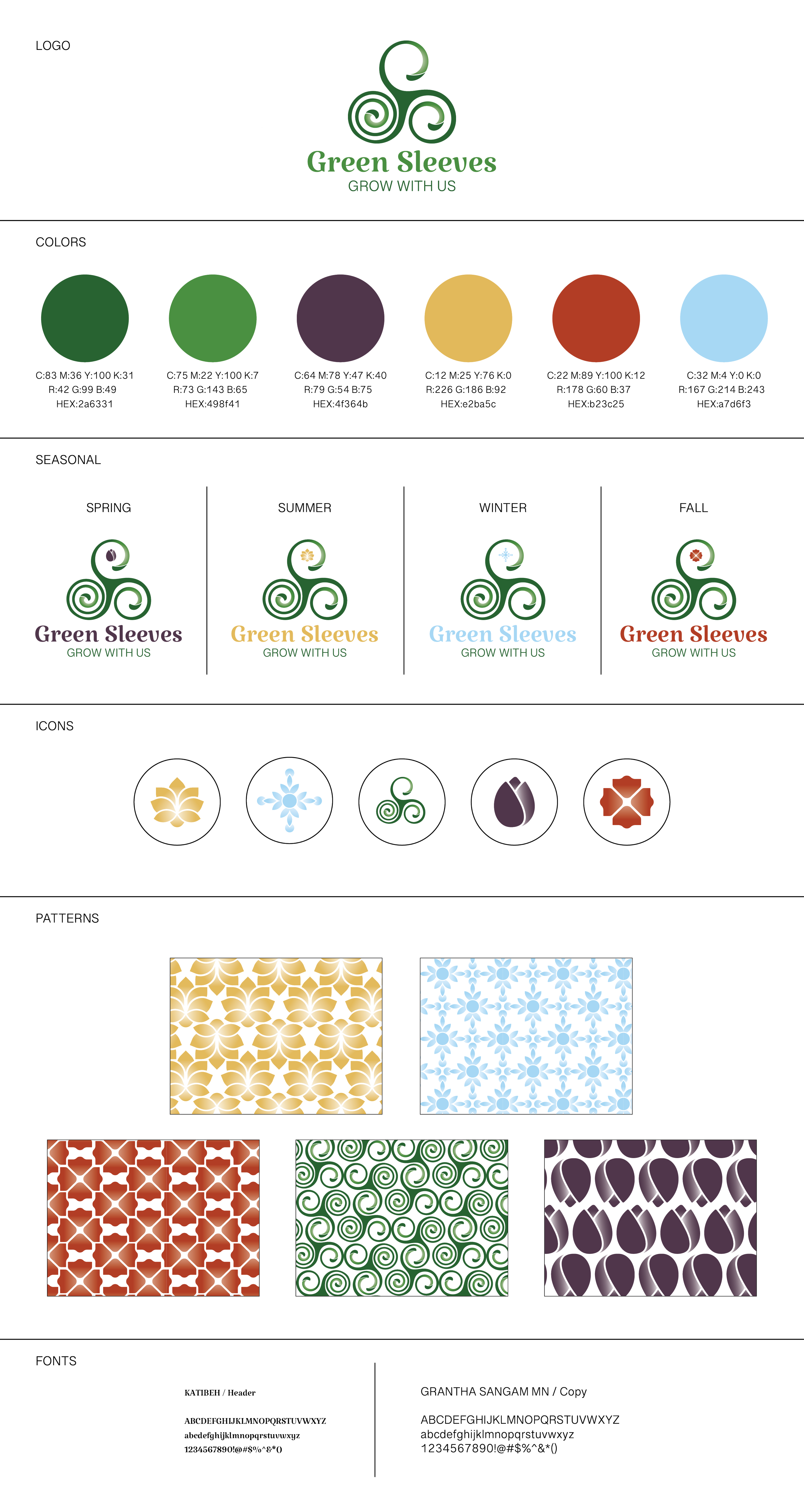
Once the logo was established, I explored color combinations that felt elevated and intentional while still reflecting the natural, approachable personality of the business. This led to two core colors that became the foundation of the primary identity.
03 — Seasonal Variations
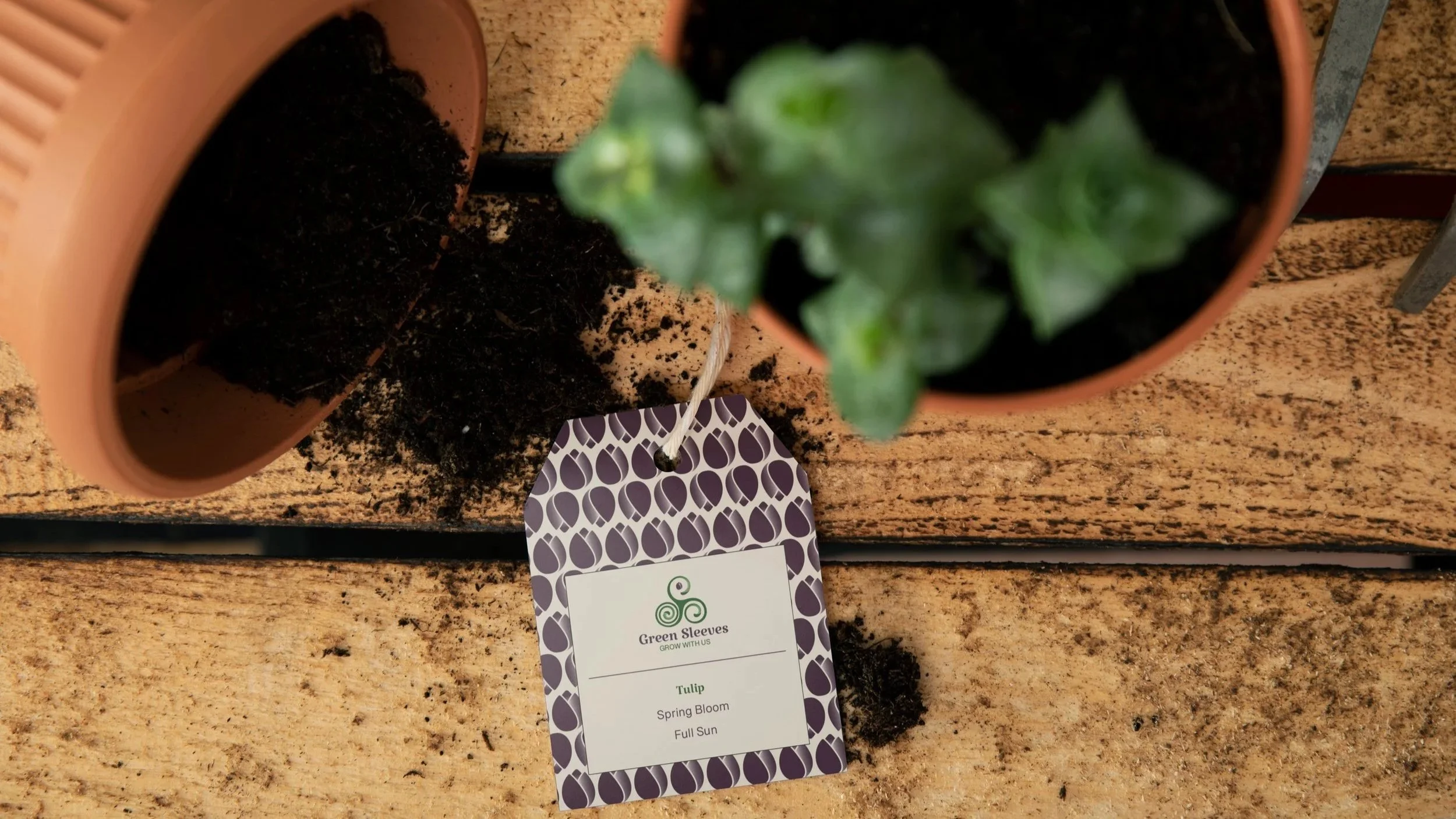
The client originally envisioned four different seasonal logos. Instead, I recommended building from one recognizable primary logo, then creating seasonal variations through secondary colors and custom elements inspired by each season.




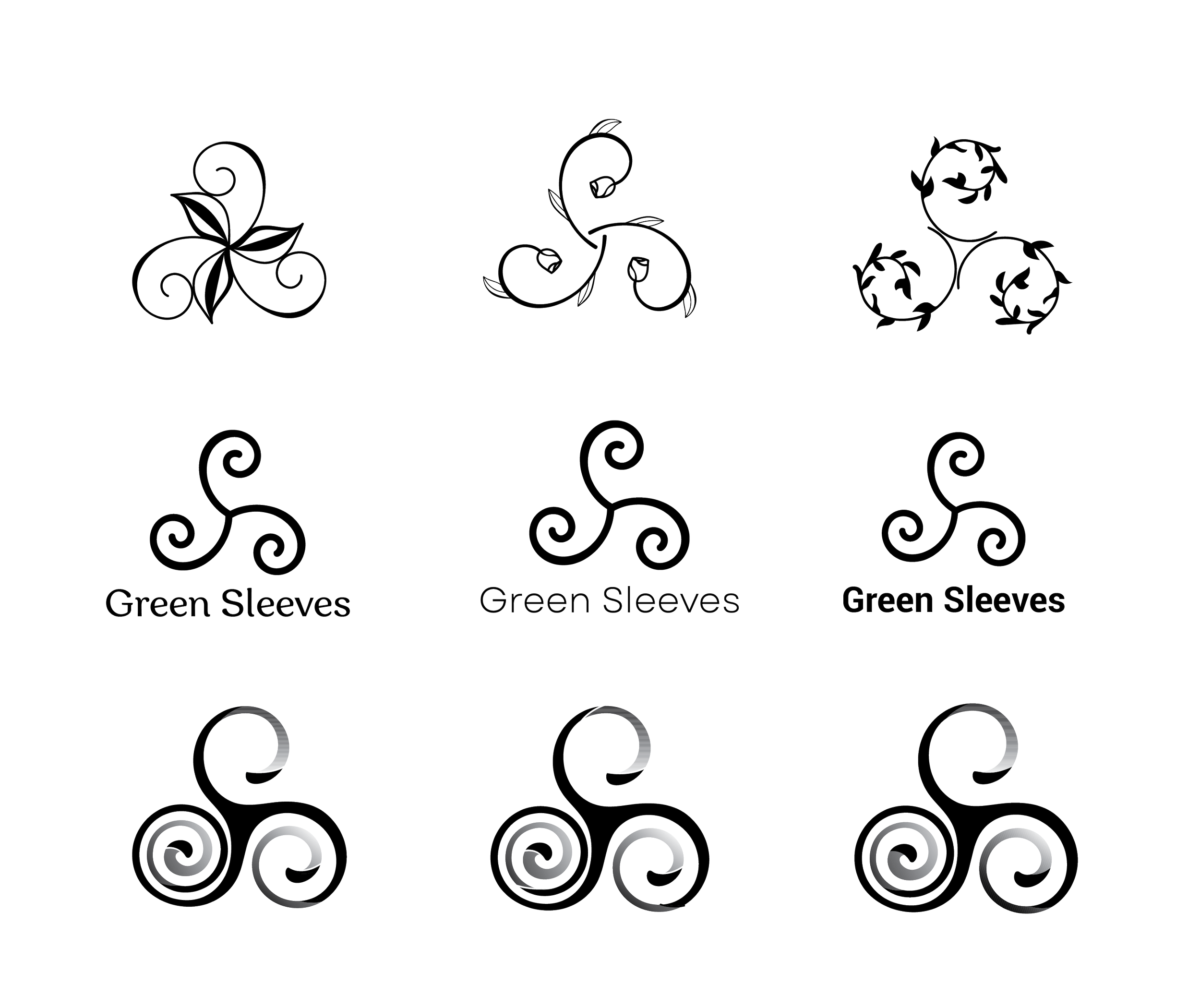
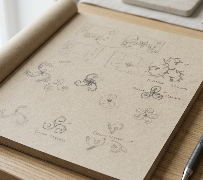
01 — Black & White Exploration
I began in black and white so I could focus on the strength of the logo before introducing color. I explored different ways to refine the original triskelion, working through its shape, movement, and relationship with the typography.
04 — Building the Identity System
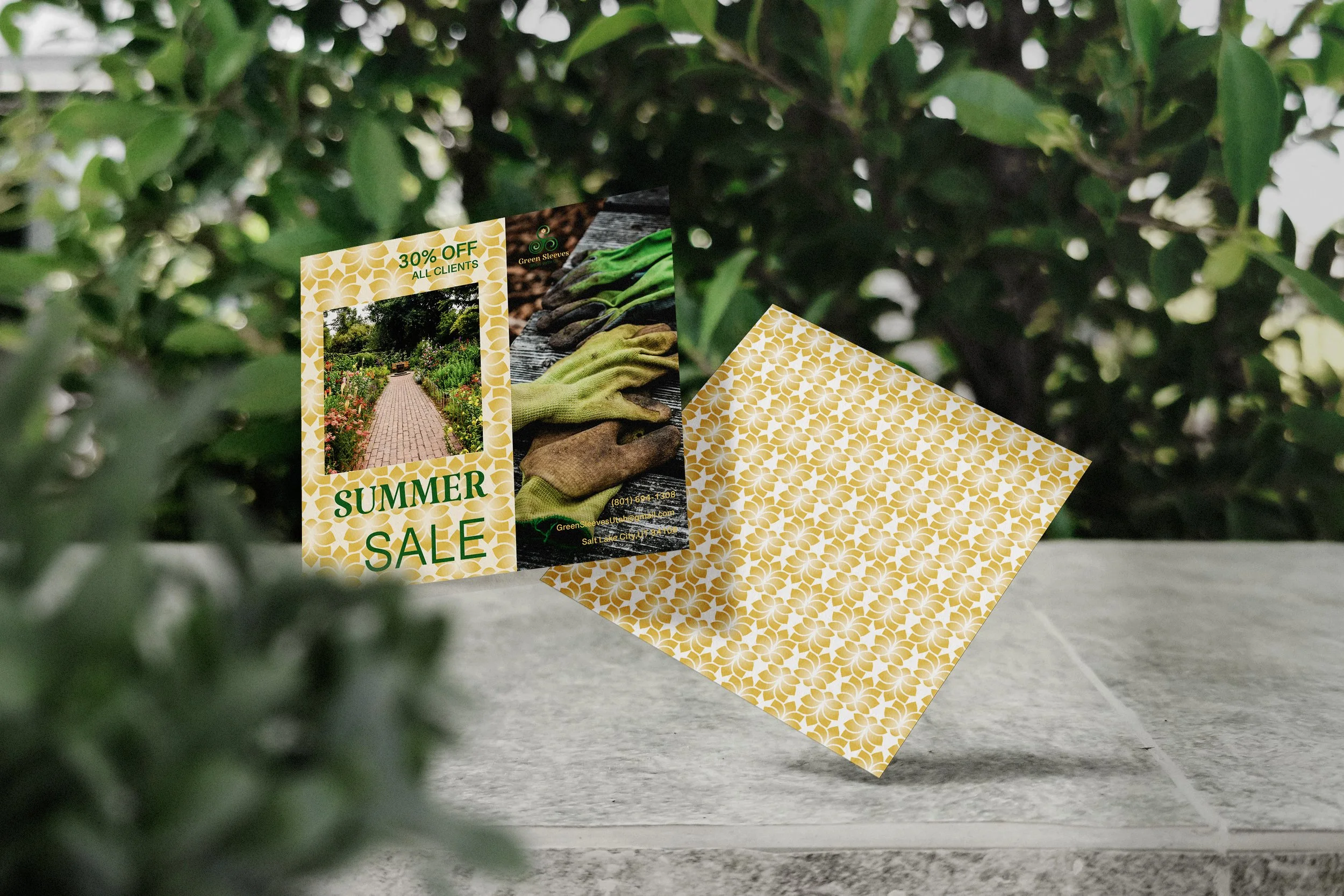
With the foundation established, I expanded the identity into a complete visual system. The primary and secondary logos, brand colors, typography, icons, seasonal marks, and patterns were designed to work together and give Greensleeves a consistent identity across different applications.

The project began with,
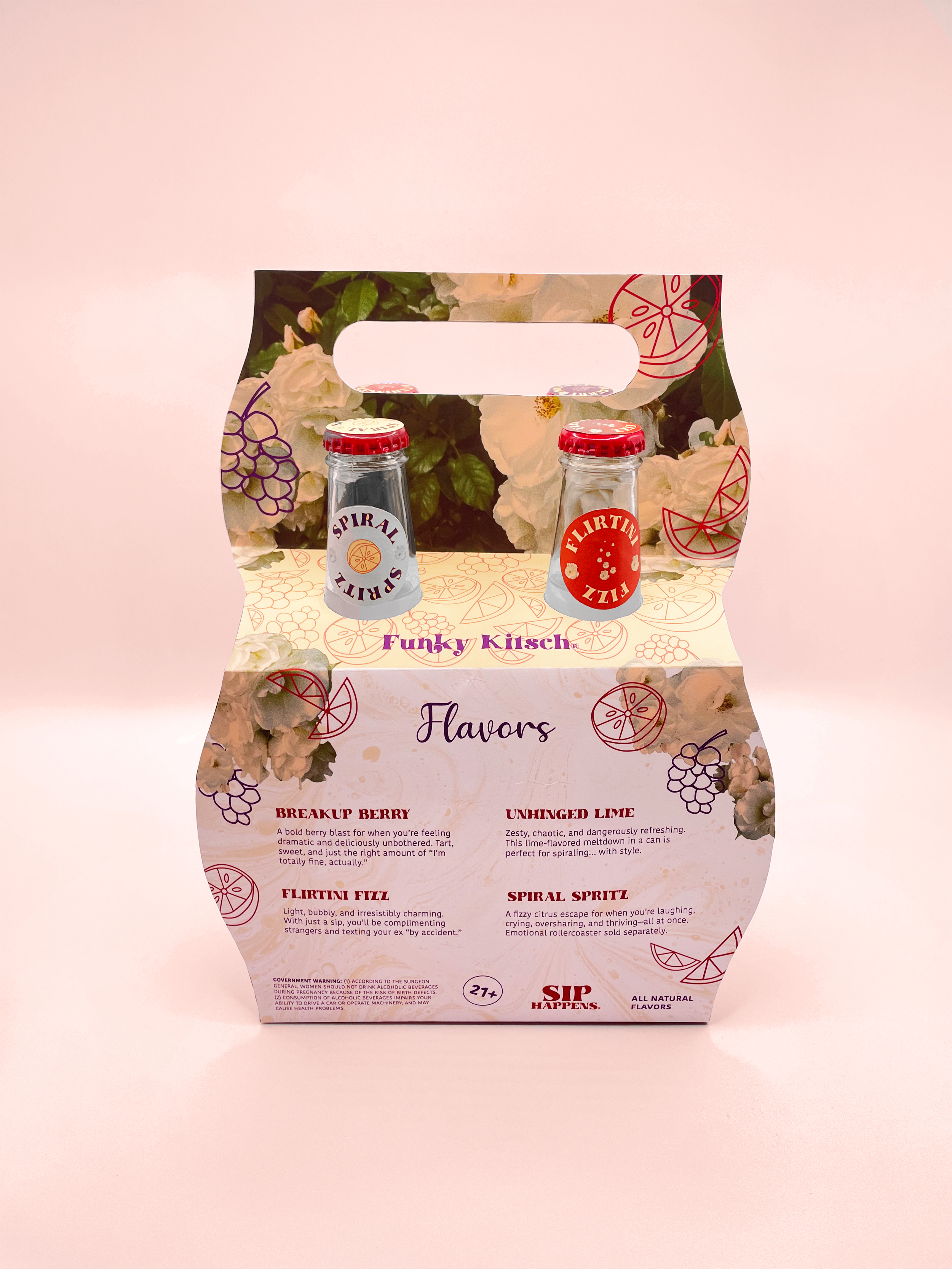
an open-ended brief: create something playful, unexpected, and a little kitschy that could still exist as a real product. With no predetermined product or brand, I developed the concept, identity, and packaging completely from scratch.
01 — Research & Explore
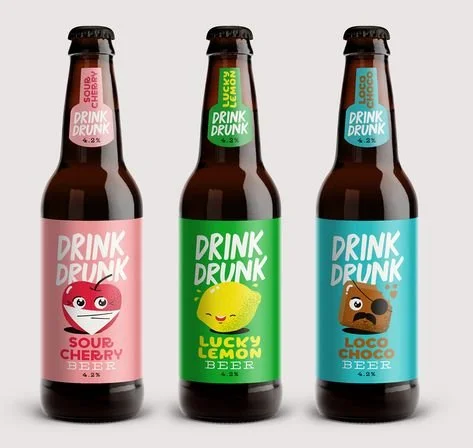
I started by researching kitsch aesthetics and brainstorming several product concepts through sketches and quick digital explorations. I eventually landed on beverages because they gave me the opportunity to explore both label design and a more unique structural packaging challenge.
Sip Happens
01 — Research & Explore
I started by researching kitsch aesthetics and brainstorming several product concepts through sketches and quick digital explorations. I eventually landed on beverages because they gave me the opportunity to explore both label design and a more unique structural packaging challenge.
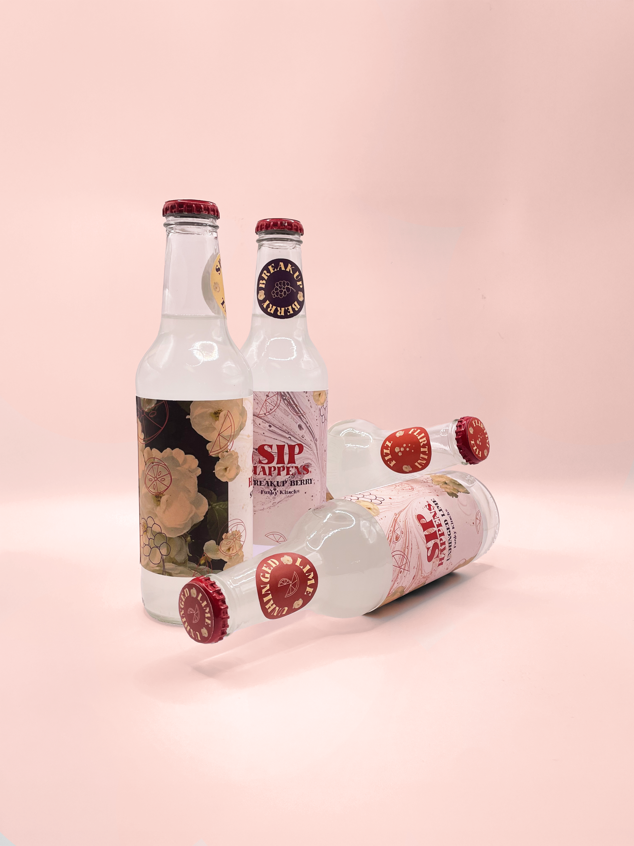
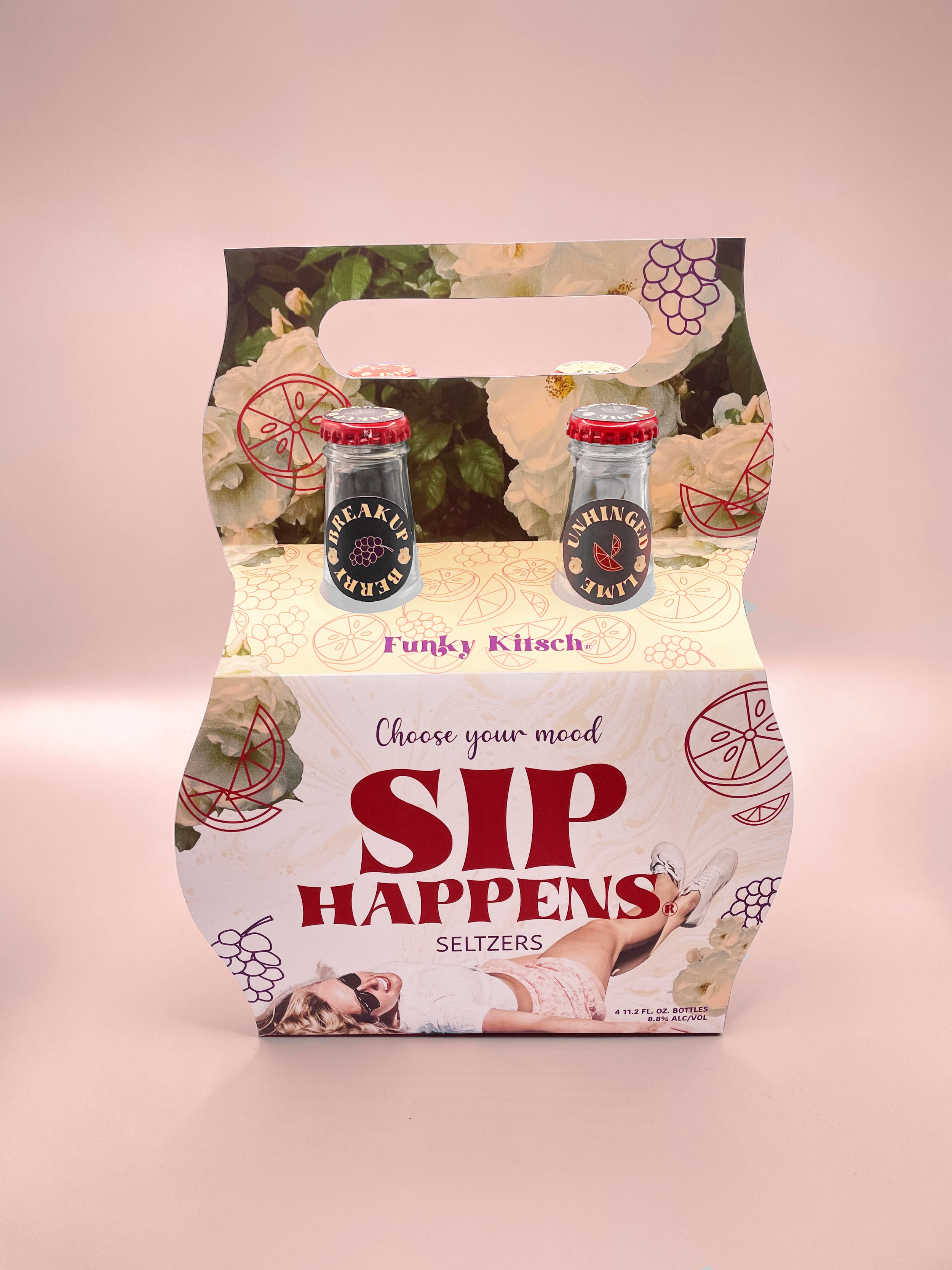
I developed Sip Happens,
from concept to final packaging, including the brand direction, individual bottle labels, four-pack carrier, custom dielines, and physical prototypes.

01 — Find the Direction
I researched the location, target audience, and competing gelato shops to understand where Gelato Palace could stand apart. While many competitors felt youthful and playful, I wanted the brand to feel elevated and authentically Italian while still being colorful and approachable.
02 — Develop the Identity
I began in black and white, sketching and refining the logo before introducing color. I illustrated the “Gelato” lettering myself and incorporated a palace into the letterforms to give the identity a distinctive Italian feel.
03 — Build a Visual Language
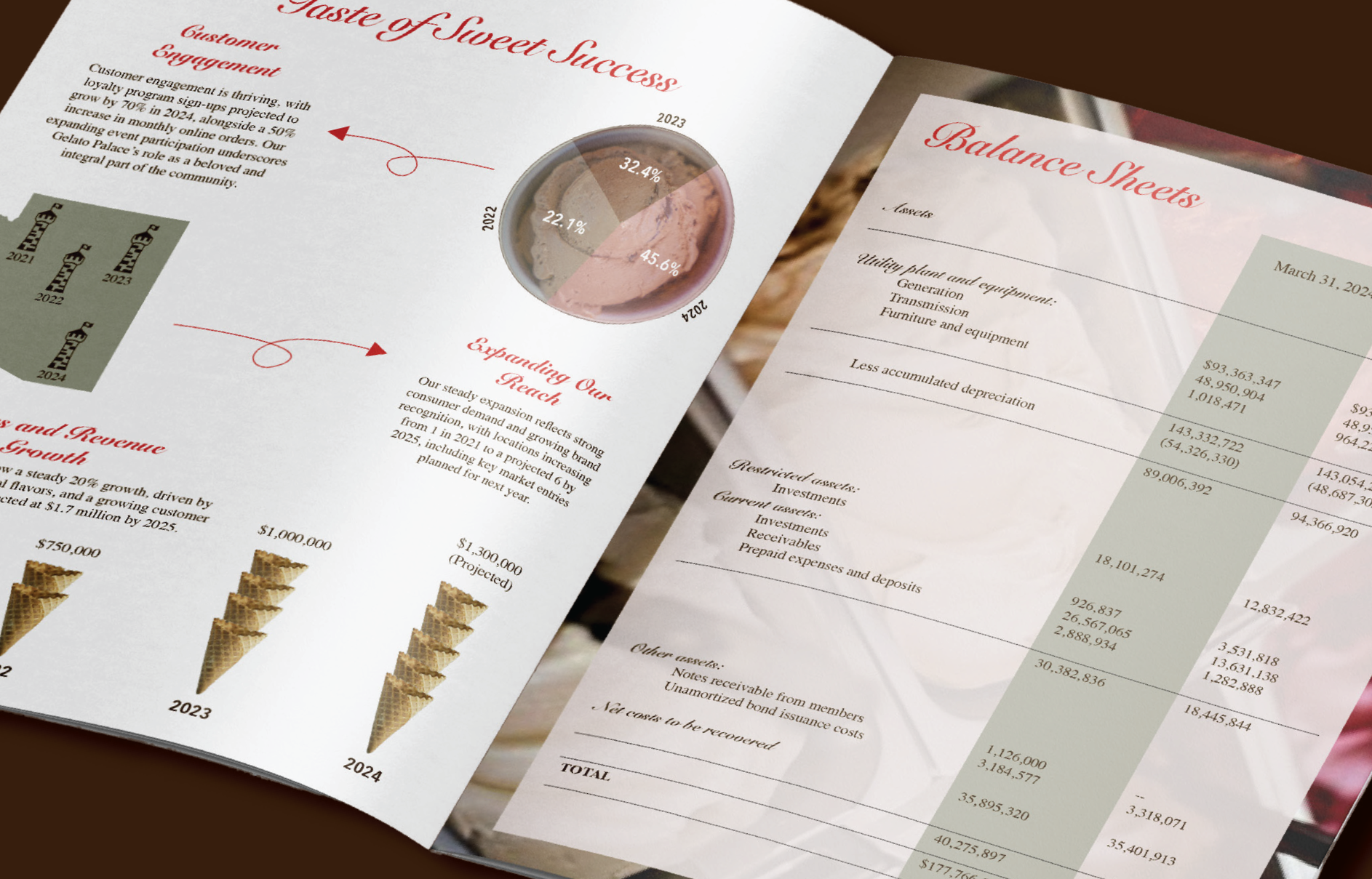
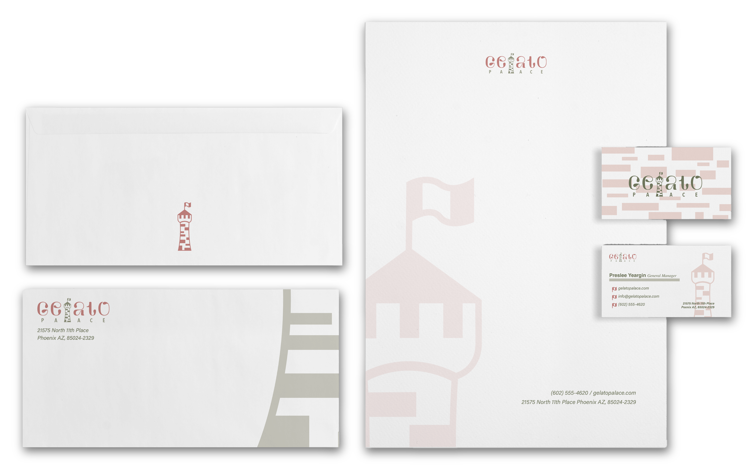
Once the logo was established, details from the palace—its bricks, flag, curves, and silhouette—became patterns and graphic elements. Paired with the typography and color palette, these gave me a larger system to design with instead of simply repeating the logo.
04 — Expand the Brand
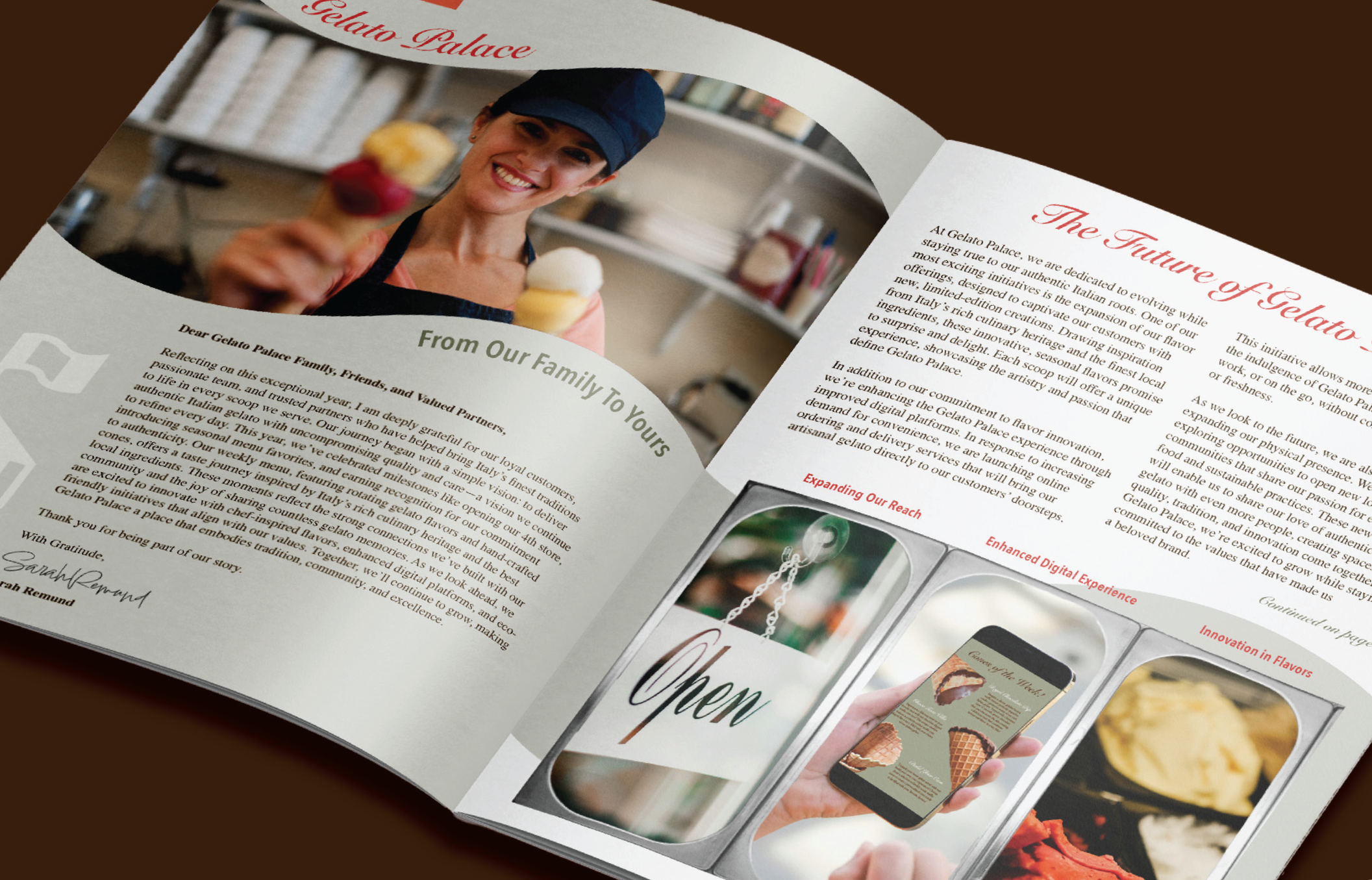
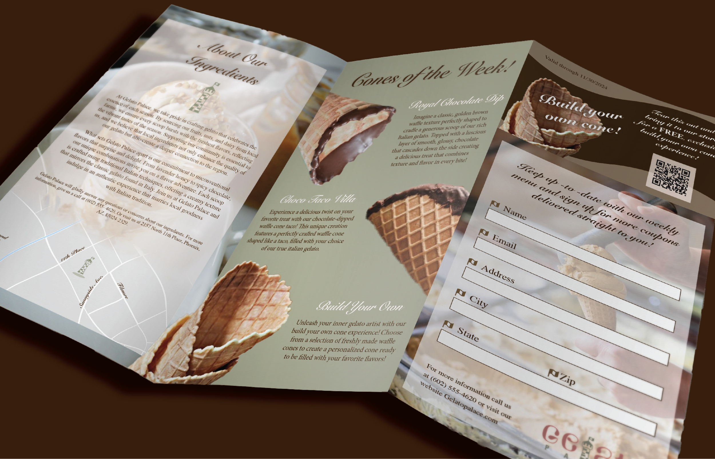
I carried that system into a range of applications, adapting it to different communication needs while keeping each piece unmistakably Gelato Palace—from advertising and stationery to the brochure and annual report.