Green Sleeves
Brand Identity - Visual System - Print Collateral
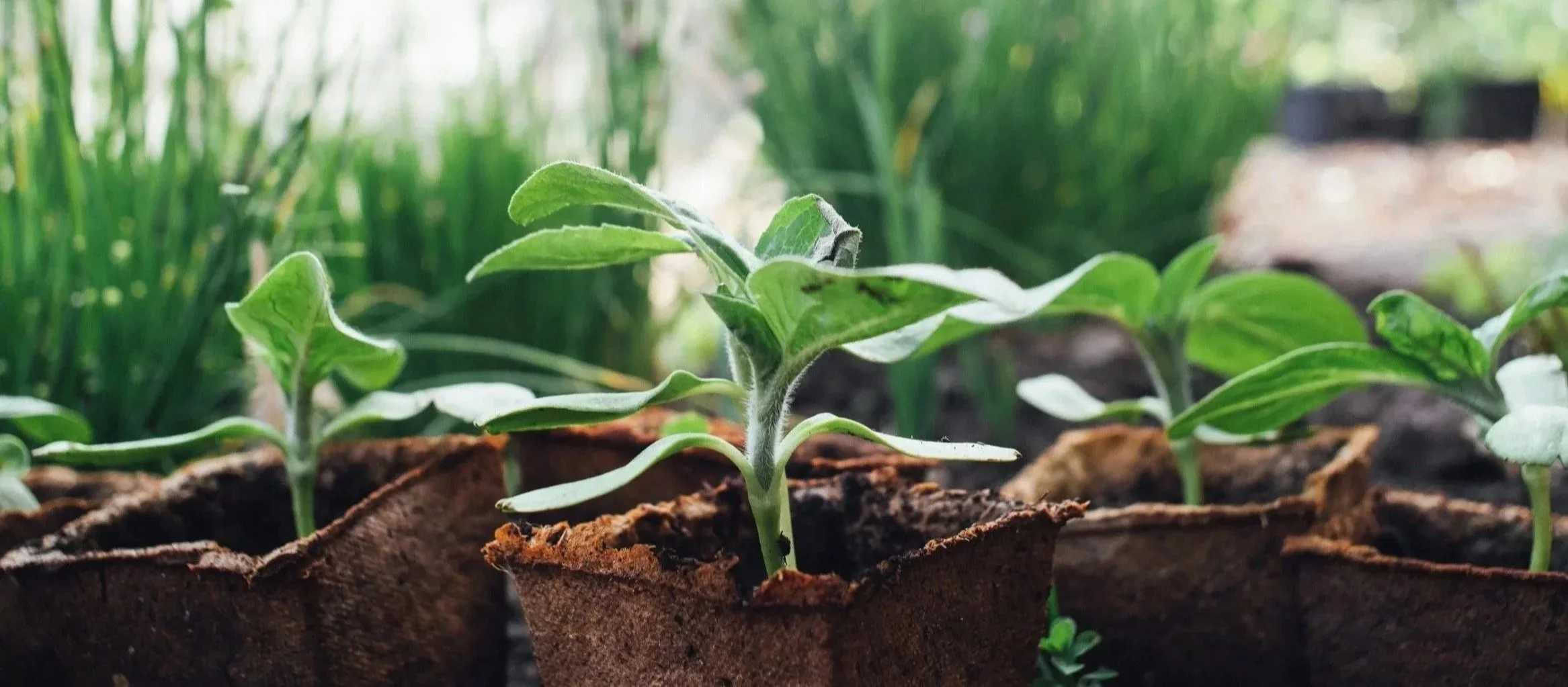
Green Sleeves Landscaping is a Salt Lake City–based landscaping brand designed to bring a sense of elegance and seasonality to a traditionally functional industry, using organic forms, structured composition, and a flexible visual system.

COLORS
The color palette is rooted in natural greens, with seasonal accent colors introduced to create variation, energy, and adaptability throughout the brand.
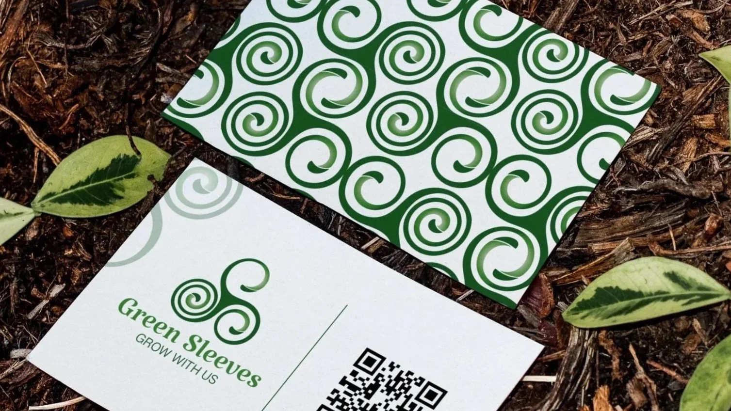
LOGO
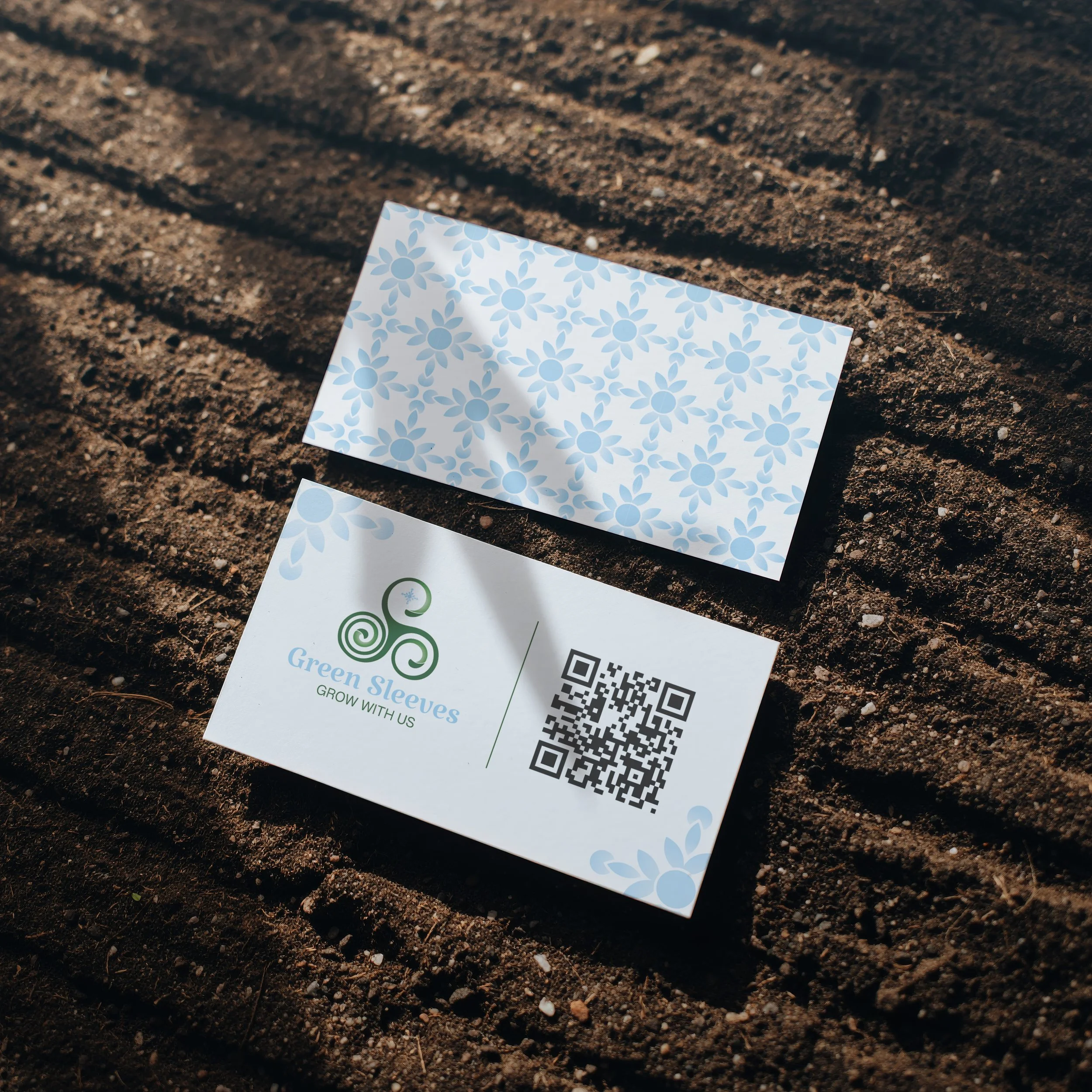
The logo draws from organic growth and movement, using curved forms to reference nature while maintaining a refined, scalable structure.
Brand Identity
The identity system balances organic forms with structured composition, creating a refined and adaptable visual language that carries consistently across the brand.

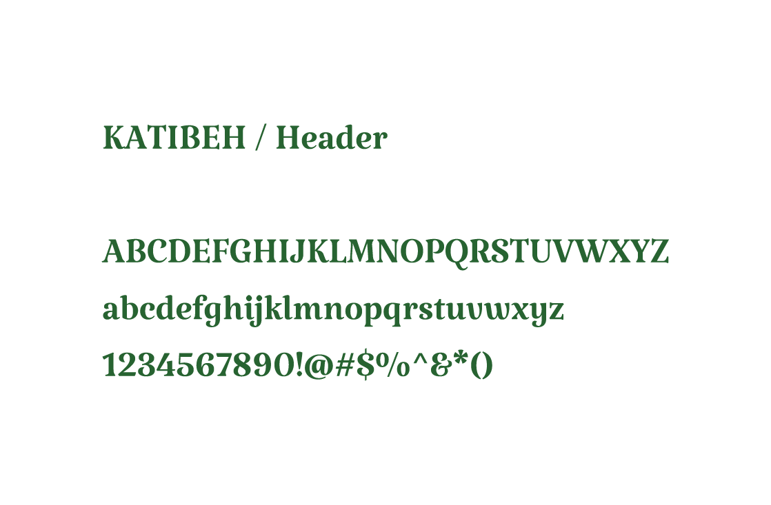
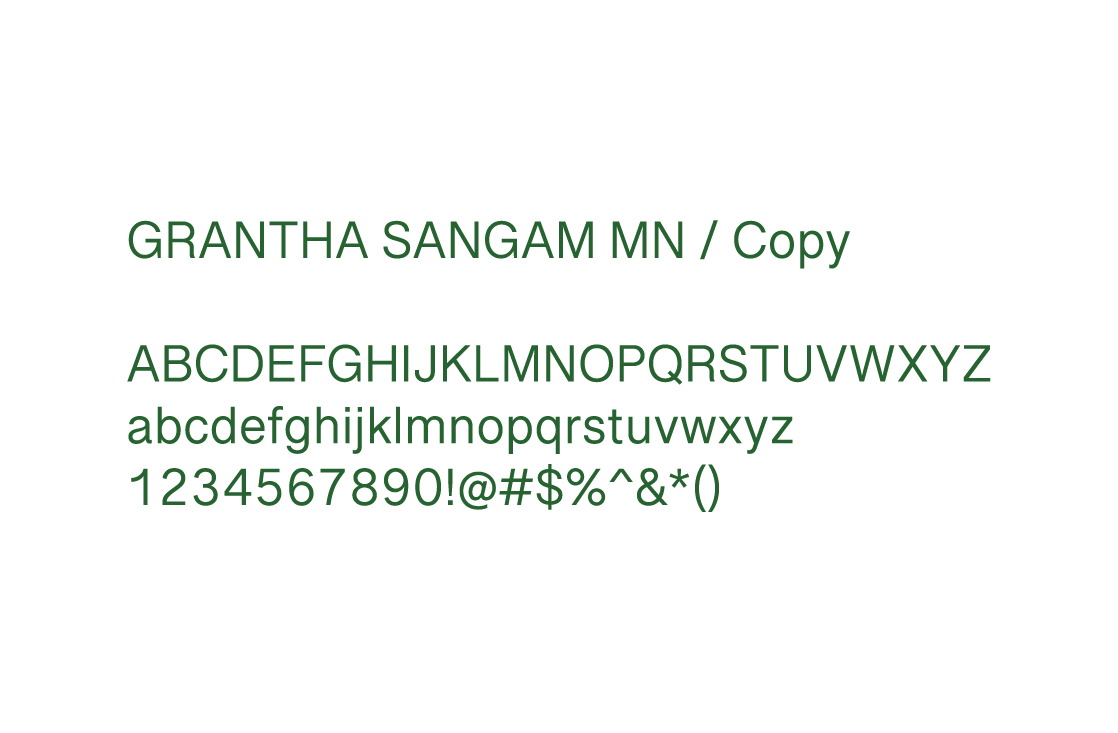
TYPOGRAPHY
Typography balances structure with softness, pairing a refined serif with a clean supporting typeface to ensure clarity across applications.
GROW WITH US
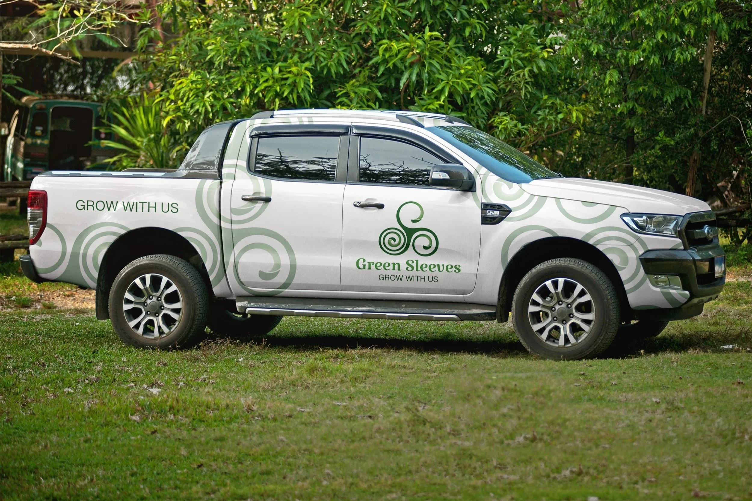
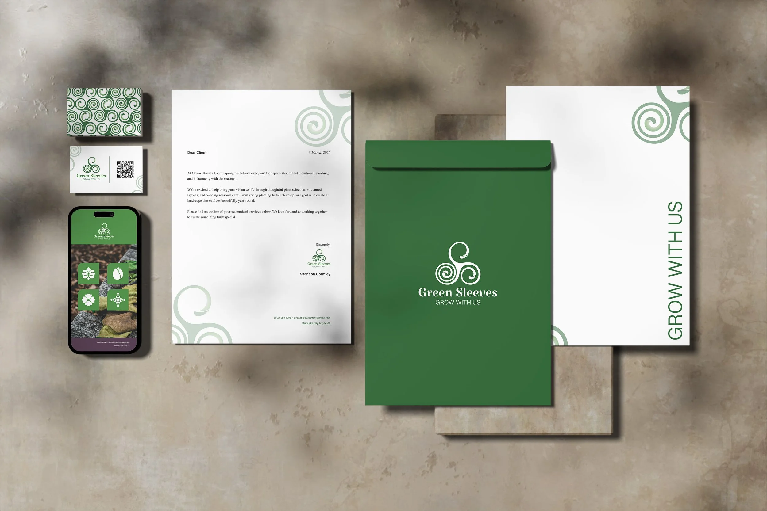
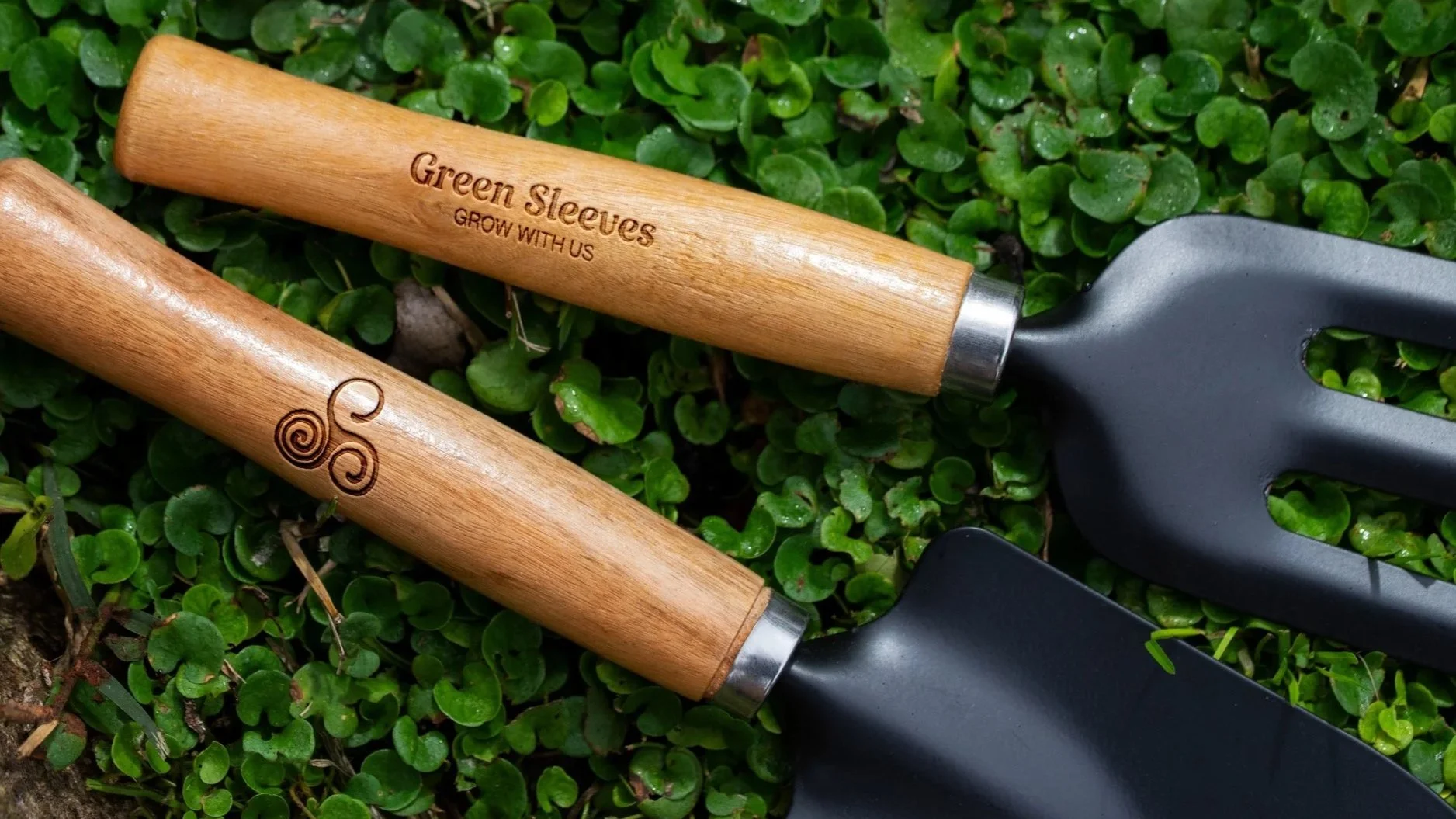
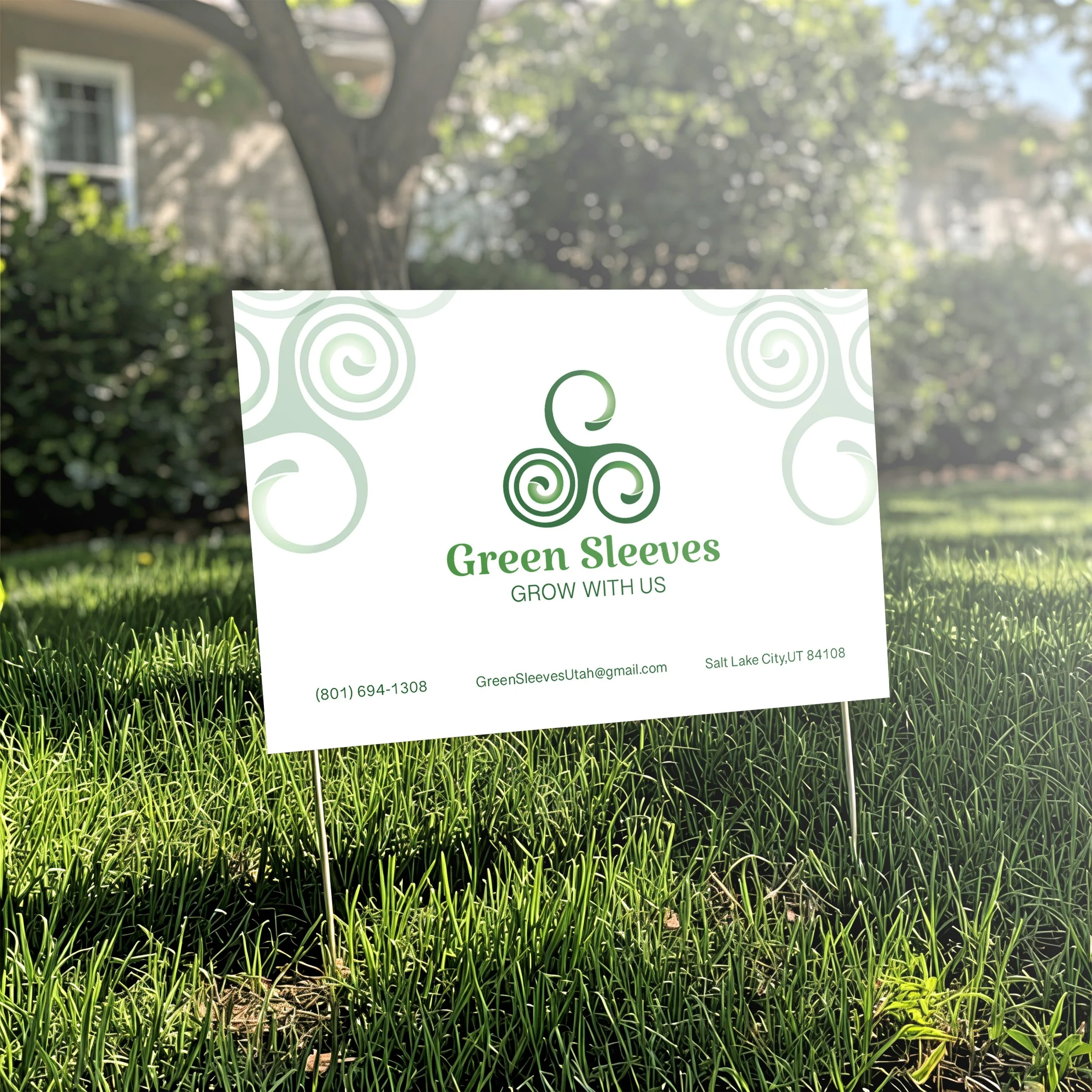
Application
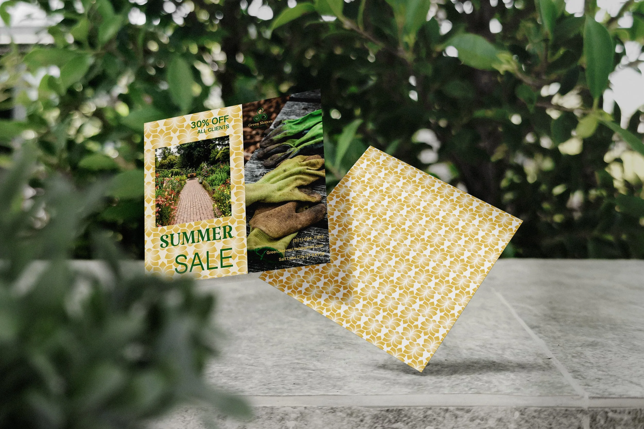
The brand extends across a range of real-world applications, using consistent color, typography, and pattern to create a cohesive and recognizable presence.
GREEN SLEEVES


PRIMARY 1
C:83 M:36 Y:100 K:31
R:42 G:99 B:49
HEX:2a6331
PRIMARY 2
C:75 M:22 Y:100 K:7
R:73 G:143 B:65
HEX:498f41
PRIMARY 3
C:64 M:78 Y:47 K:40
R:79 G:54 B:75
HEX:4f364b
SECONDARY 1
C:12 M:25 Y:76 K:0
R:226 G:186 B:92
HEX:e2ba5c
SECONDARY 2
C:22 M:89 Y:100 K:12
R:178 G:60 B:37
HEX:b23c25
SECONDARY 3
C:32 M:4 Y:0 K:0
R:167 G:214 B:243
HEX:a7d6f3
SPRING

SUMMER

FALL

WINTER

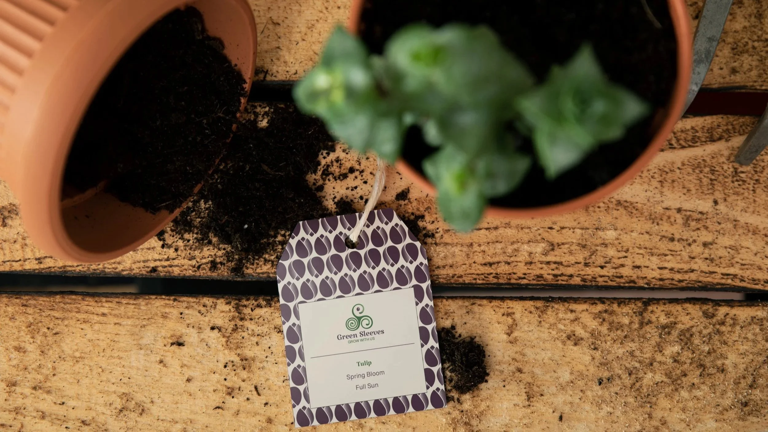
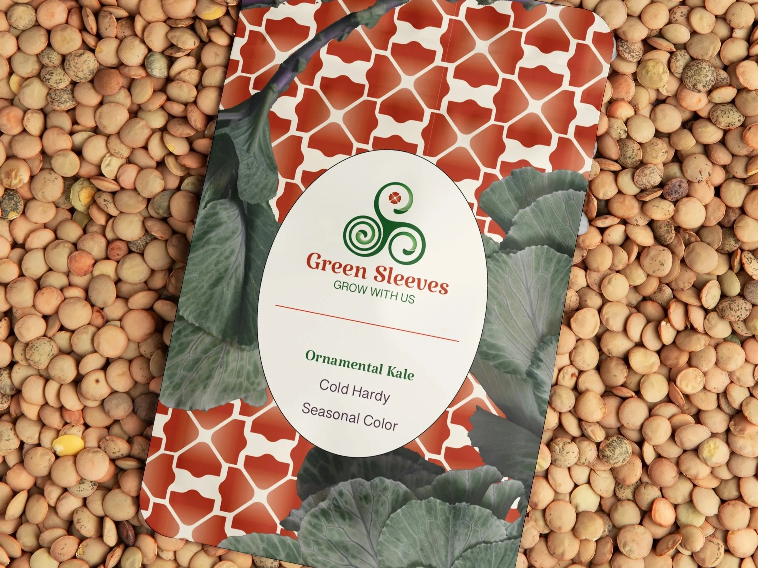
Seasonal Variations
The identity adapts across seasonal variations through color and pattern, allowing the brand to shift in tone while maintaining a consistent and recognizable system.
Green Sleeves Landscaping is built as a flexible and cohesive brand system, designed to adapt across seasons while maintaining a consistent and recognizable presence.