Gelato Palace
Brand Identity - Brand Application - Packaging
Gelato Palace is an elevated gelato brand inspired by traditional Italian craftsmanship, brought into a modern, approachable context. The identity combines custom typography, architectural elements, and a vibrant color palette to create a system that feels both refined and inviting.


INITIAL EXPLORATION
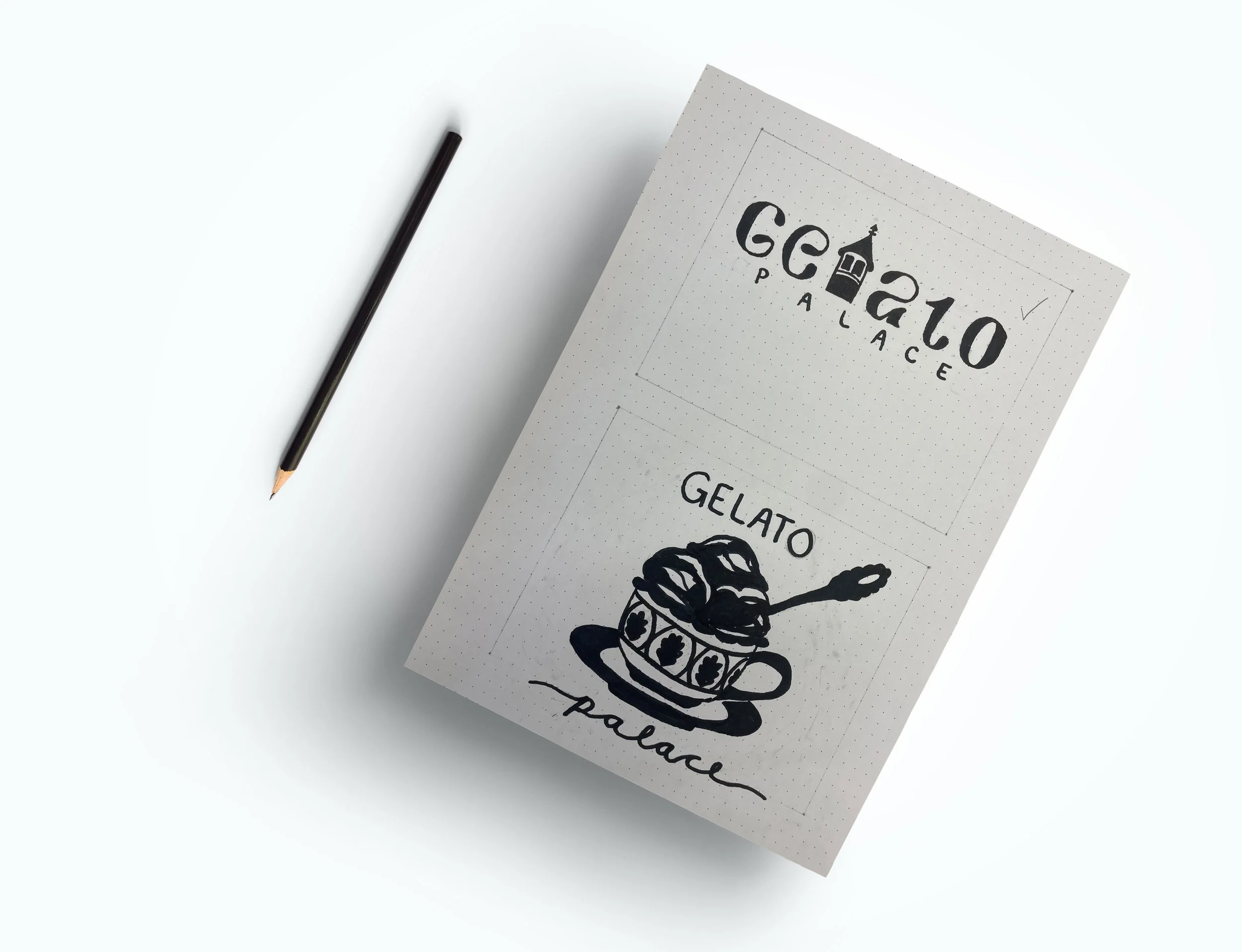
Brand Concept
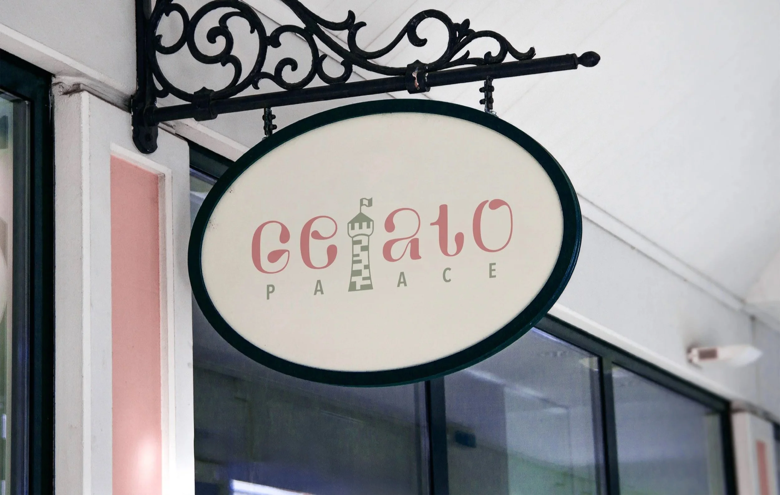
The identity draws from traditional Italian architecture and craftsmanship, using custom typography to create a distinctive and memorable mark. A stylized tower is integrated into the letterform, introducing a playful focal point while reinforcing the idea of a “palace” through structure and form.

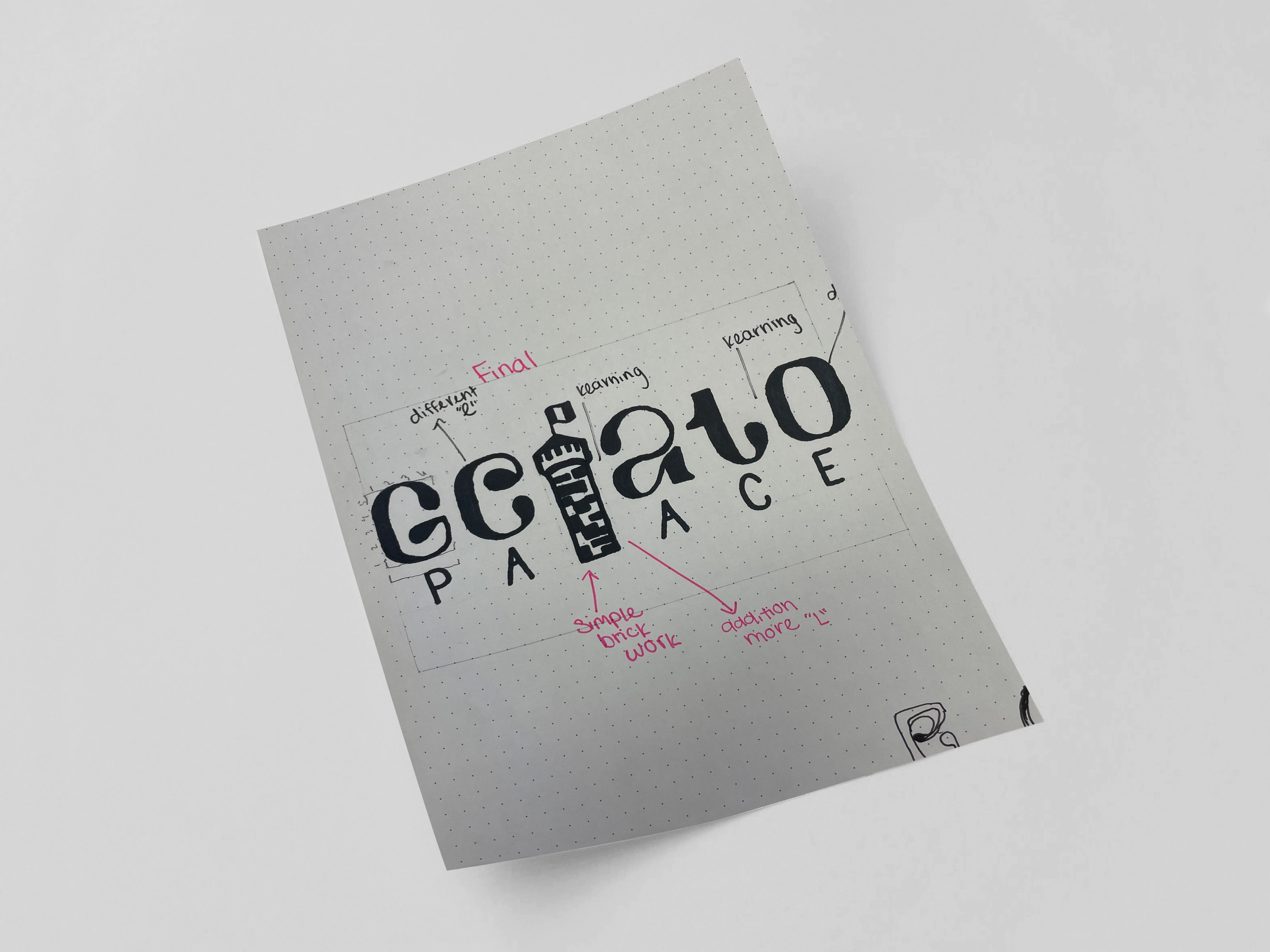
FINAL MARK
C:20 M:54 Y:42 K:1
R:200 G:133 B:129
HEX: c88581

Brand Identity
The identity system combines custom typography, a warm color palette, and refined type pairings to create a balance between elegance and approachability. Each element works together to establish a cohesive and recognizable visual language across the brand.

C:54 M:39 Y:65 K:14
R:118 G:125 B:98
HEX: 767d62
C:15 M:54 Y:100 K:87
R:59 G:28 B:0
HEX: 3b1c00

C:0 M:91 Y:85 K:0
R:239 G:62 B:54
HEX: 5A5625

Elements
A flexible visual system built around the tower motif, repeating brick pattern and flag wave, used to bring personality and consistency across the brand. These elements extend the identity beyond the logo, creating recognizable and adaptable applications.


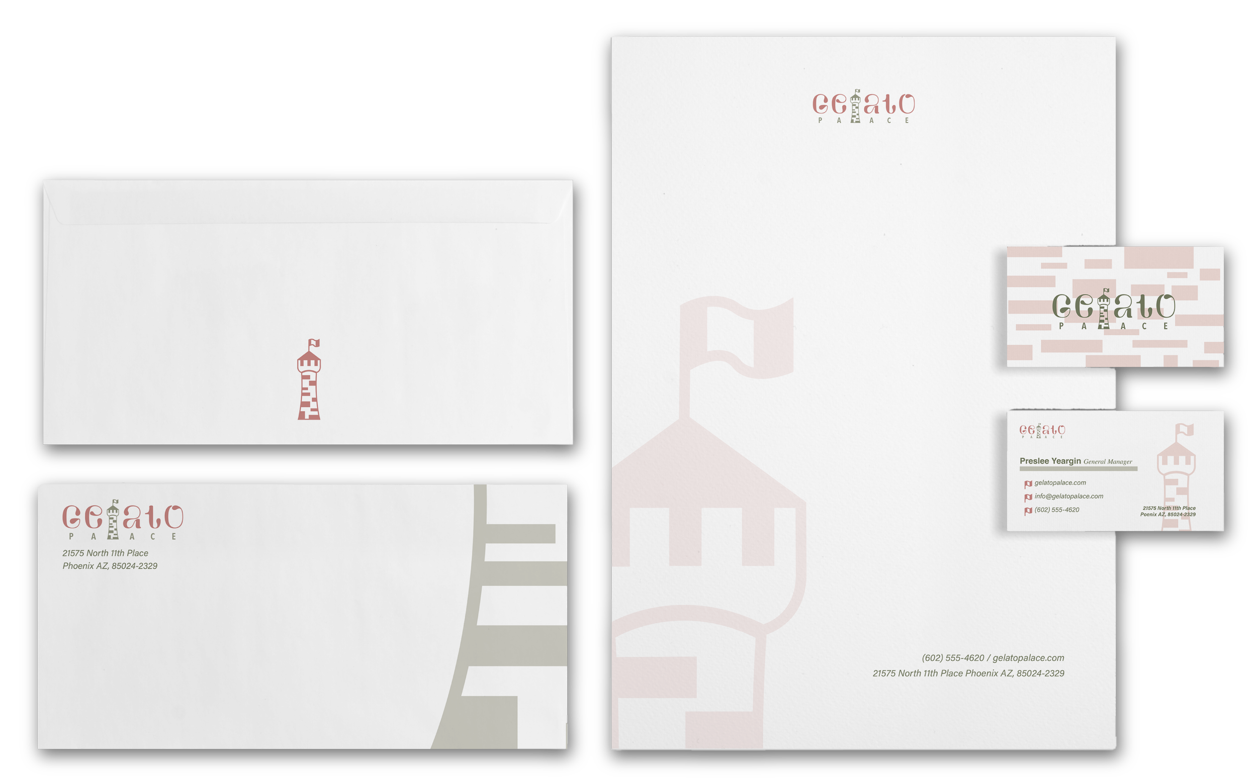
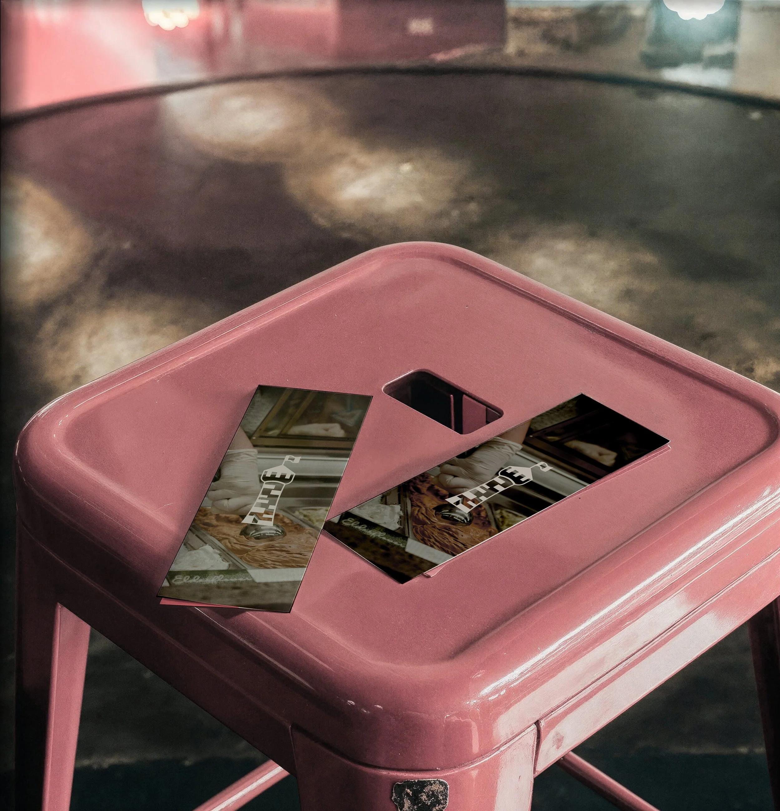
Stationary
The stationery system applies the brand with a focus on simplicity and refinement, using subtle color, typography, and pattern to create a clean and cohesive set of materials.
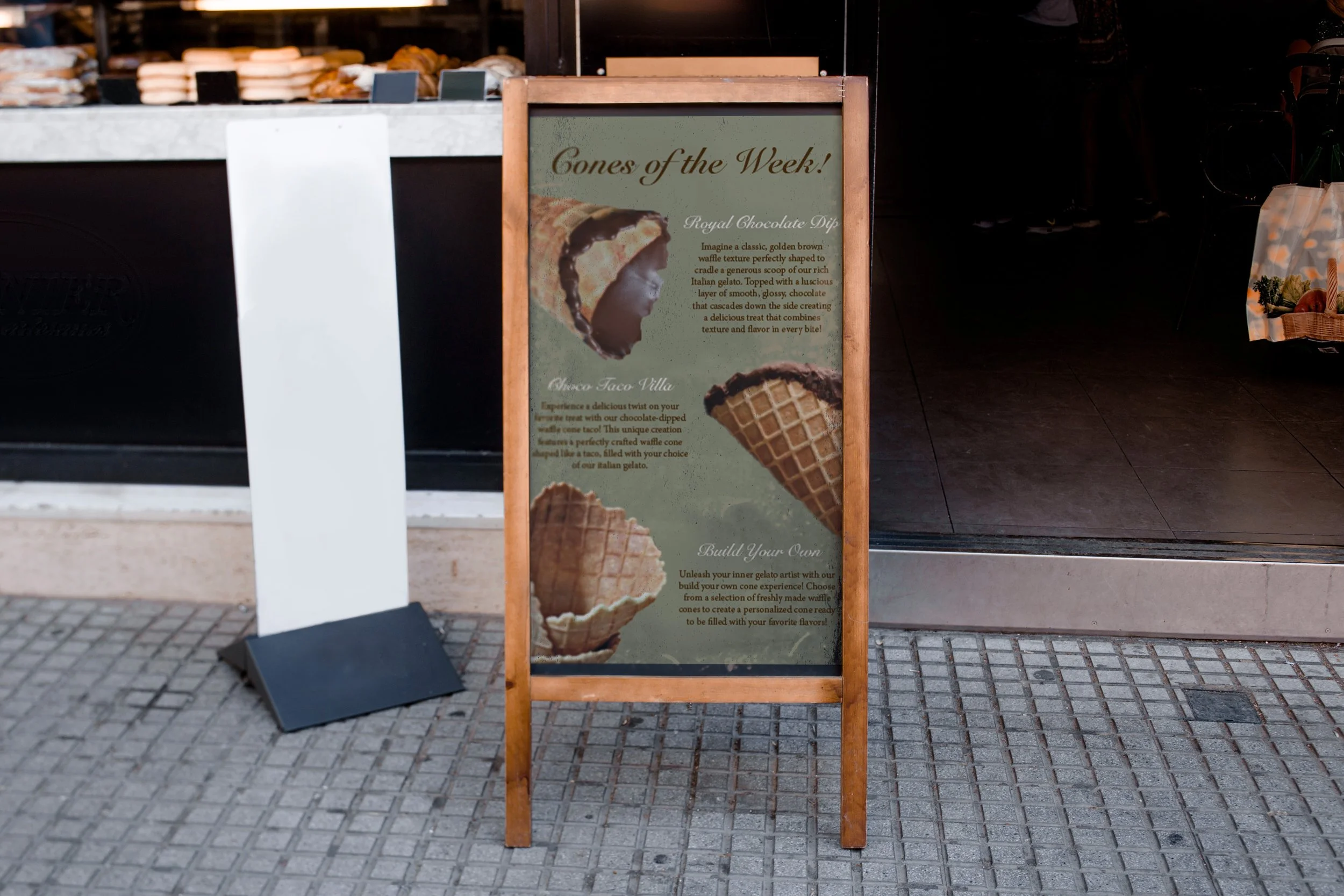
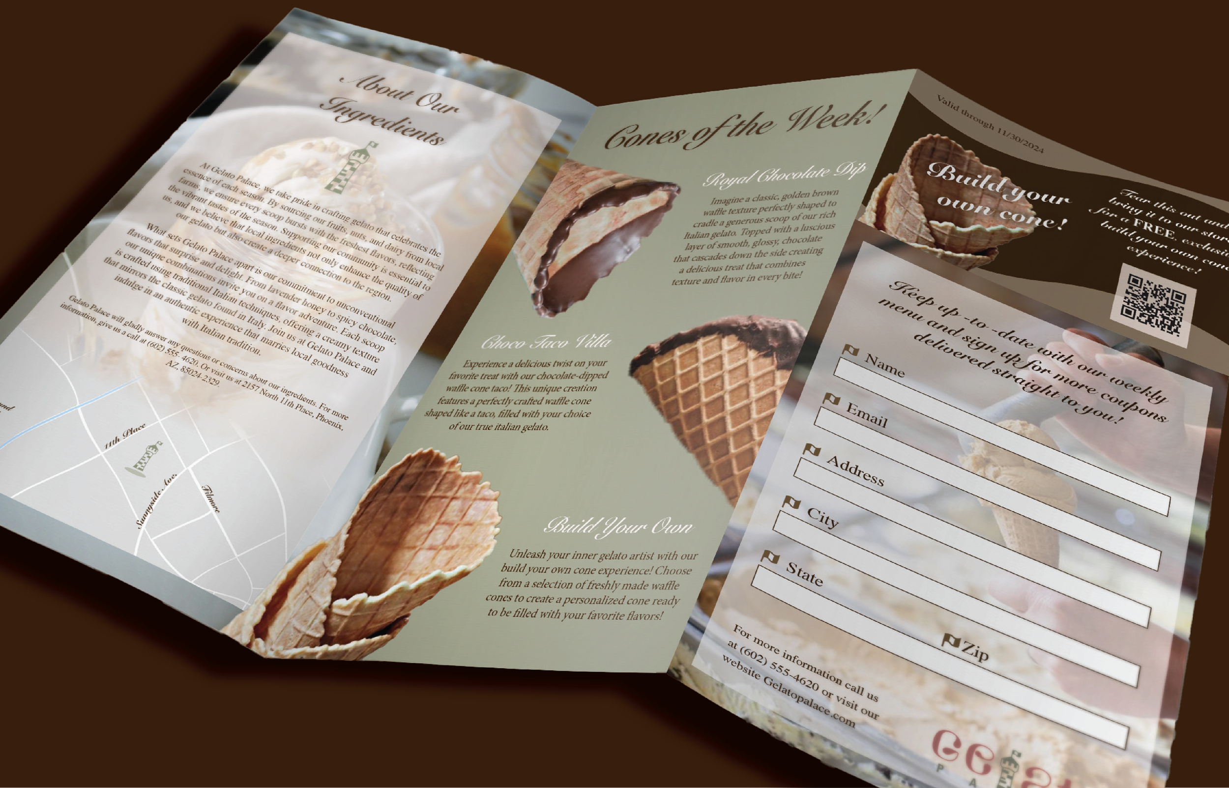
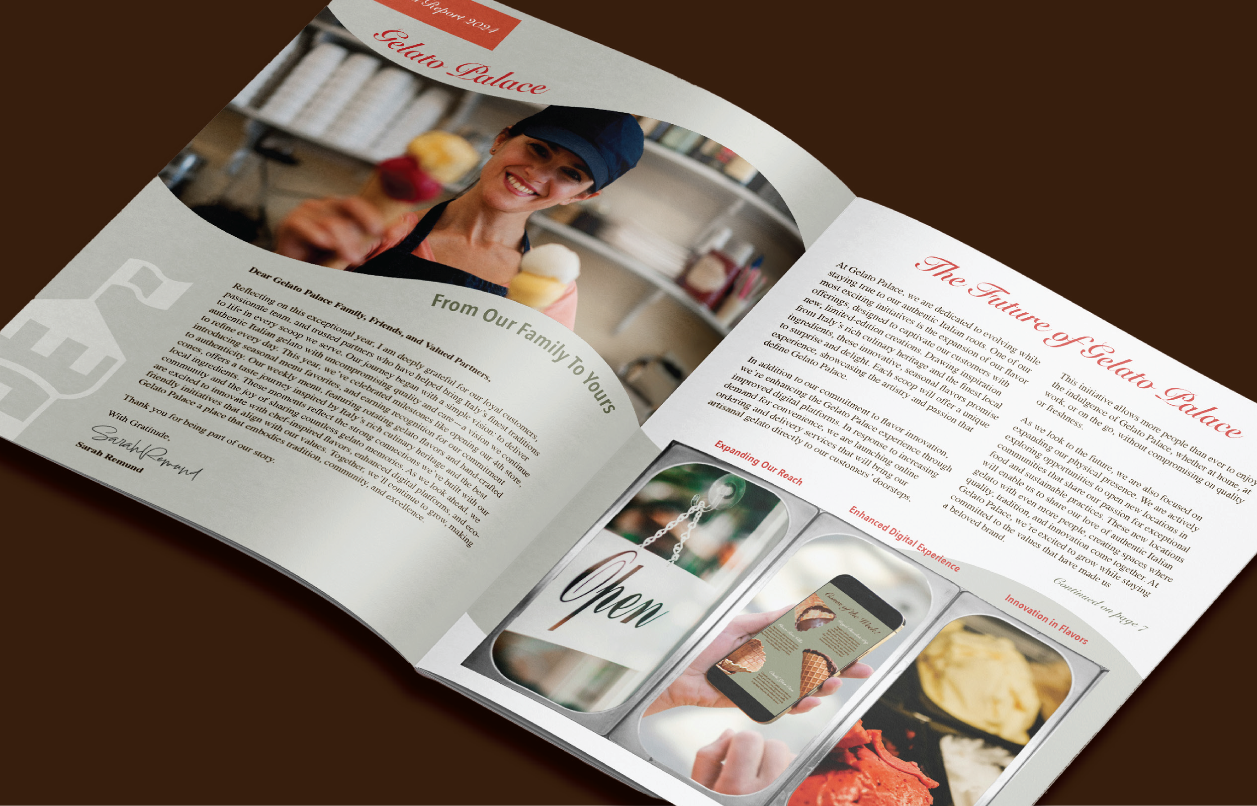
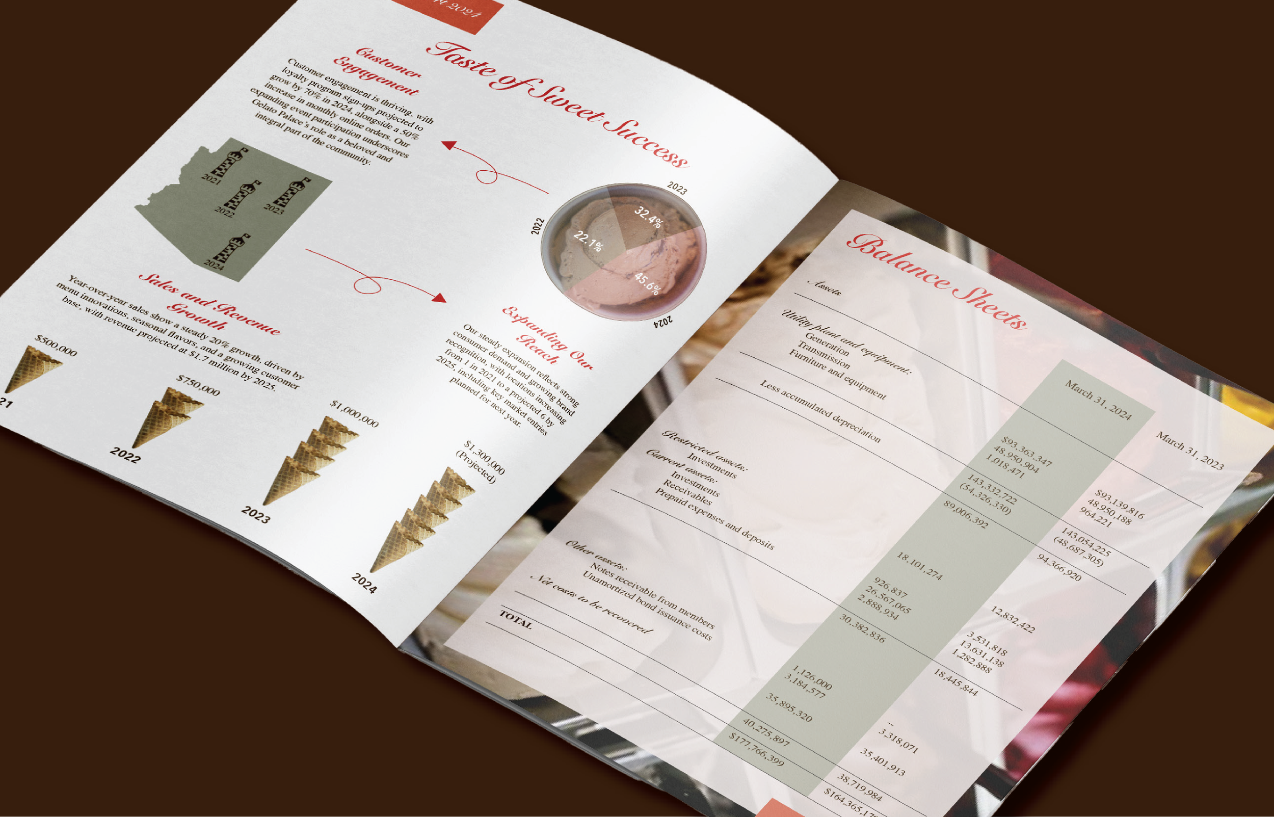
Marketing Applications
The brand extends across marketing applications through cohesive use of imagery, typography, and color, creating an inviting and elevated experience across printed collateral and in-store materials.
Gelato Palace is designed as a cohesive brand experience, balancing tradition and modernity through thoughtful typography, color, and application.